News Homepage built with HTML, CSS Grid and Flex and some Javascript
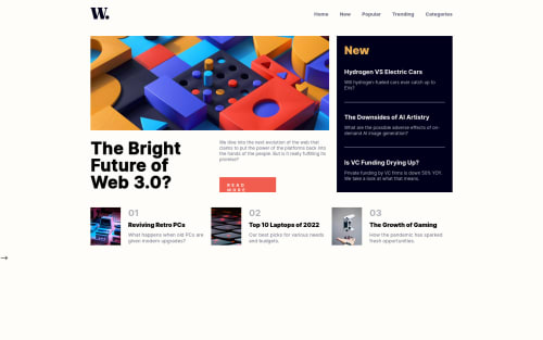
Design comparison
Solution retrospective
I am very new to frontend development and this is actually my very first complete frontend project. I'm curious as to whether I approached the task in the right way, that is, the way I structured my HTML code or if there was a better way I could have done it. I am also wondering if there's a way to write less CSS and achieve my desired results. I want to learn to be as efficient as possible and avoid redundancy. Being my first project I would appreciate any feedback/criticism as it would help me learn more and improve my work. Thank you in advance!
Community feedback
- @ZhiulPosted almost 2 years ago
Hi! Really great, amazing work :) There are still a few things you could do in order to make it better:
-
You should make it responsive all the way from mobile to desktop. I think desktop could start from around 768p. (You should use other media queries).
-
Let's say you set the desktop version to trigger at 768p. Either way, you must aim to make it look good. So you would need to set up some padding and other things. And when it comes to the hero image, chances are a
background-image
could fit better, as you could set it to automatically fit the container. -
You must use more semantic elements like
<header
><main>
<section>
and so on. Not only that, I highly suggest you also to give more meaningfull classes name, likehero
btn-primary
article
and so on, if you inspect high quality code you will see how some people name things really well. Also giving a try to the BEM convention can be great. -
In your
<header>
you woud like to use a<nav>
and when it comes to the links like Home, news and so on, you should use aul
inside the nav, useli
elements and inside those li elements include anchor tags. In this way, you would make it a lot more semantic. -
READ MORE
should be a button. Also try to use HTML headings when they would be semantic... -
I think you are using a small
font-size
for certain elements in comparison to the design. So I suggest you to make some texts a bit bigger. -
At last, but not least if you used rem you could make it more accessible. By using rem you could have some challenges, but, you would increase A11Y a lot.
Marked as helpful1@crawler990Posted almost 2 years ago@Zhiul Hello! Thanks a lot for the feedback. Sorry I couldn't get back to you sooner, I had exams ongoing but now I am done. You've really given me a lot to think about, especially like using semantic elements and the responsiveness, and I will look into every bit of detail you've mentioned and hopefully I can submit an improved solution. Again thanks a lot!!!
0 -
- @NabilWasirPosted almost 2 years ago
Hello there, great work on the desktop version
But I think you haven't made the mobile version and the website isn't responsive. You can see my solution to this challenge to improve it. Hopefully, it will help you.
And you should use semantic HTML Tags like
<main></main>, <section></section>
etc., If you use these semantic HTML tags then you won't get an accessibility issue.Hopefully my feedback is helpful to you
Marked as helpful1@crawler990Posted almost 2 years ago@NabilWasir Hey! Thanks for the feedback and I have checked your solution. There is a responsive mobile version but only starting from 375px. I will make it more responsive to more devices and submit an improved solution. I've also just realized the importance of semantic elements, I'll try to use them in a better way. Thanks a lot again!!
0 - @jahongirdevPosted almost 2 years ago
Nice work bro 👍 Never give up! Let's go!
1
Please log in to post a comment
Log in with GitHubJoin our Discord community
Join thousands of Frontend Mentor community members taking the challenges, sharing resources, helping each other, and chatting about all things front-end!
Join our Discord