News homepage built with Astro


Design comparison

Solution retrospective
I used Astro for the first time which was really nice. What I might do differently is how I style the components. Astros scoped styling is nice but I wonder if having the styles in their own stylesheet is a bit neater and easier to follow since you'd use classnames instead of Astros autogenerated fingerprints.
What challenges did you encounter, and how did you overcome them?Astro encourages using its scoped styling, but due to this when I tried using a separate Astro component in a style selector I found it didn't work despite using :global() in the selector. So I decided to combine the components into the one file again instead of having them in separate files.
Probably just the structure of my styles in general but nothing in particular.
Community feedback
- P@jyeharryPosted about 1 month ago
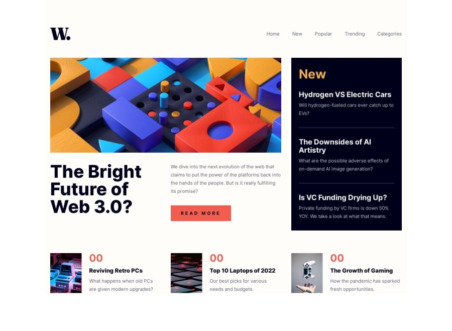
Disregard the "00" labels in the popular articles section at the bottom of the design comparison. I think the tool frontendmentor uses to generate the screenshots for the comparison must use an outdated browser or something. I've noticed similar issues on other challenges which used styles that are relatively new.
If you view the live site you'll see the correct label numbers.
0
Please log in to post a comment
Log in with GitHubJoin our Discord community
Join thousands of Frontend Mentor community members taking the challenges, sharing resources, helping each other, and chatting about all things front-end!
Join our Discord