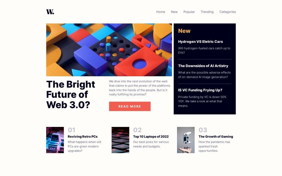
Design comparison
Solution retrospective
Hi, peeps o/
I really struggle on the grid alignment in this project. Couldn't figure it out how to align the read more btn with the end of the news. Other thing is the nav menu that, when resizing the screen, does this really fast flick in and out of the screen. Maybe it's something that just happens, becouse CSS .-.
I would really love some feedback on this project. Not really the most bealtiful code but I did my best :)
TY
Community feedback
- @Randall3475Posted over 1 year ago
The flicker happens, because as soon as the screen reaches 670px, you put a transition and a translateX on the nav. This should not be an issue, because when you visit your site on a small screen - for example on a mobile - the browser would already render your nav element with the styles appropriate for the screen size, hence the style change does not happen and there would be no flickering. You could also observe this behaviour on big sites even.
Marked as helpful1@Randall3475Posted over 1 year ago@rwxganta You're welcome! You could also prevent it from happening, by adding the transition property after the translateX is added.
1
Please log in to post a comment
Log in with GitHubJoin our Discord community
Join thousands of Frontend Mentor community members taking the challenges, sharing resources, helping each other, and chatting about all things front-end!
Join our Discord
