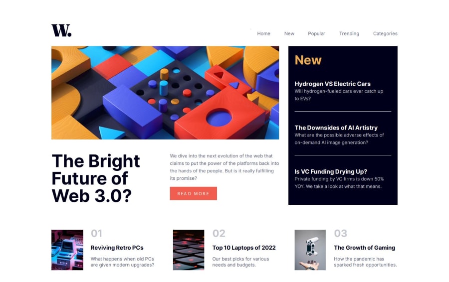
Design comparison
Solution retrospective
I am glad I was able to finish this project and learn a lot from it. I am really thankful to the FrontEnd Mentor project because it lets me learn and improve my coding skills with real challenges. So thanks a lot fam :D
There are quite some issues I will like to improve and fix in this projects. And yes, I know that I have to finish the toggle menu (with JavaScript) on the mobile version - I can do that later.
Other than that, I am really conscious with the measurement, like the proper distance of the sections, padding, the correct width and height of each section, and so on, so if anyone see an issue with the measurement or how I can improve it in my project I will also appreciate those words.
Also, I don't think that my code is responsive. I am kinda struggling with that.
Thanks a lot community!
Community feedback
Please log in to post a comment
Log in with GitHubJoin our Discord community
Join thousands of Frontend Mentor community members taking the challenges, sharing resources, helping each other, and chatting about all things front-end!
Join our Discord
