Design comparison
SolutionDesign
Community feedback
- @lukag111Posted almost 2 years ago
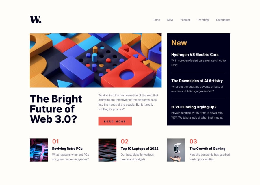
The text color is too light and the color of the button needs to be red and on hover effect to be red. A logo is not the same as we have in materials.
The Mobile version does not work correctly, you need to add width:100% to the grid cover all page. And you have to improve side menu.
Everything else is good.
0
Please log in to post a comment
Log in with GitHubJoin our Discord community
Join thousands of Frontend Mentor community members taking the challenges, sharing resources, helping each other, and chatting about all things front-end!
Join our Discord
