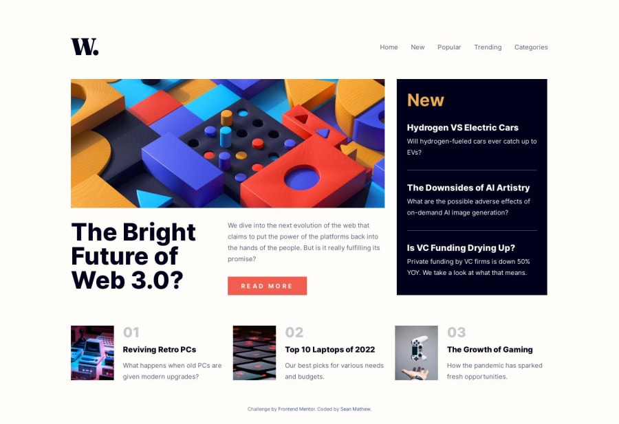
Design comparison
Solution retrospective
Hello!
So this is my second project on Frontend Mentor and I was looking for something a little bigger than the 3 column page I did. Based on the comments I got on my last solution which helped a ton, I found CUBE CSS and a lot of other super helpful sites. I really like what I saw with the CUBE CSS methodology so I wanted to give it a shot. This is my first time working with that, CSS custom properties, CSS variables and javascript as well so it was quite a lot. The solution I came up with still has some flaws that I couldn't figure out and I list those down below but overall I think it was a great learning experience that definitely helped advance my overall knowledge of web development.
Things I had trouble with: Javascript - I have no experience with javascript and have not taken a course on it yet. I'm about to take the Javascript basics course on scrimba to learn the basics and start writing my own js scripts from scratch. Any suggestions on javascript courses / tutorials that you think would be a good starter point would be highly appreciated.
Media Queries: Being only the second time working with media queries it was a little hard at first but I'm starting to learn how they work with max-width / min-width for different sized devices. If anyone has or knows of a good tutorial / article on media queries I would love to learn a lot more about how to use these.
Things that I couldn't figure out: I couldn't figure out why the primary-navigation does the animation off screen every time you size the page down where the hamburger menu appears. I tried a few things but really didn't know where to look or what the change to fix this issue. I know this is probably a simple issue to fix but I just don't have the knowledge yet. I figured between frontend mentor and google I can figure it out.
I also noticed that the first click on the hamburger menu does not work. Like I said I have no experience in javascript so this could be a issue with my script and I wouldn't know it. Hopefully I'll look back at this after the basics course and it will be an obvious easy fix. I'm hoping....
As I've said before I just starting learning frontend development so there's a ton that I've already learned that I would change on this page but I wanted to upload this as a progress project because I learned so much from it.
Gotta give a shout-out to Kevin Powell on scrimba and youtube. I've been watching his stuff for the past 2 weeks and it has completely changed the way I code and learn web development.
I'm really looking forward to the next challenge to really start implementing all the stuff this project taught me. Any comments or better practices that I can work on are all welcomed. The more the merrier.
Thanks for lookin!
Community feedback
Please log in to post a comment
Log in with GitHubJoin our Discord community
Join thousands of Frontend Mentor community members taking the challenges, sharing resources, helping each other, and chatting about all things front-end!
Join our Discord
