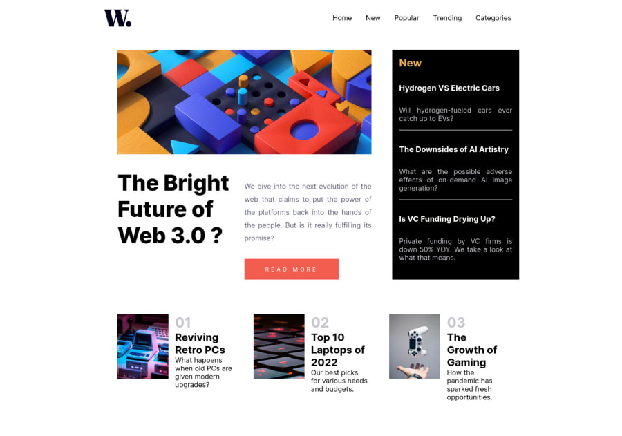
Design comparison
Solution retrospective
Suggestions/feedbacks on how to improve this code are well appreciated ;)
Please log in to post a comment
Log in with GitHubCommunity feedback
- @RamonDonadeu
The first thing I noticed, is that, in my second monitor which is smaller, the dimensions were weird.
You hardcoded the margin to center the main content of the webpage. Also, the main snippet had a weird width on the right. Using grid, which i don't really know how to use, so I wasn't able to solve it. But I did this:
First of all, I made the body to be 100% the width of the screen using vw (view width)
body{
  width: 100vw
}
Also, you didn't add any class name to the section. I usually use the "section" element for a group of content, so here i used 2 sections, one on the main content, and another on the three small images on the bottom. And on each of these add a class being FE: mainSection, numberedSection.
And then give different sizes to those classes.
As I said, the width was weird on my small monitor. Instead of setting a width:85%, make it to max-width. So in big screens, the content will not reach the end of the screen. And obviously don't use margin: 2rem 17rem. That is horrible. Use margin:auto instead. It's hard to understand at the start how it works. The parent element needs a fixed width. (Like 100vw), and if the element you want to center has width set to... f.e. 80%. Margin auto will center it for you. There is another option using flex and centering with
justify-content: center.Then on the card class you used grid. I'm more on the Flex Team, and in this case i think it's easier to use.
    display: flex;
    gap: 2rem;
    max-width: 85%;
    margin: auto;
With that, I got rid of that weird right space.
Try doing the same on the numberedSection, adding:
display: flex;
flex-direction: row;
justify-content: space-between;
Also, with inspect element, you can go to your element with flex and see the options in there and toggle them to see how they effect on your code. I think you could watch a Flex tutorial, for me, it is much more intuitive than grid, because you don't need to create the structure of 2 columns 1 row...
Marked as helpful
Join our Discord community
Join thousands of Frontend Mentor community members taking the challenges, sharing resources, helping each other, and chatting about all things front-end!
Join our Discord
