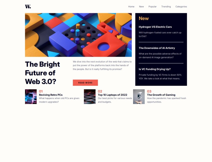


Design comparison

Community feedback
- @khatri2002Posted 2 months ago
Hi @thedanielking!
The developed solution looks good!
Few suggestions for improvement:
1. Precise Alignment of News Cards
The key aspect of the news section lies in achieving precise alignment of the news cards. Specifically:
- The
Top 10 Laptops of 2022card should align directly below theRead Morebutton. - The
The Growth of Gamingcard should align directly below theNewcard.
Issue with Current Approach:
- You used a grid layout for the news section, which is a great choice.
- However, inside the grid, you've created only three children and spanned them across 2 or 3 columns. To structure the cards within these children, you've used flexbox.
- While this works, it increases complexity as you need to carefully manage margins and gaps for all the inner flexboxes.
Instead of wrapping similar news cards within one parent, consider making each card a direct child of the grid. This simplifies alignment and reduces the need for complex gap or margin adjustments.
Now, I understand your approach to wrap the similar kind of news cards within a single parent div. It enhances the structural readability of HTML. This can still be achieved using the
display: contents;property:- What is
display: contents;?
It causes the wrapper element's children to behave as if they were direct children of the grid, effectively ignoring the wrapper for layout purposes.
.wrapper {
    display: contents; /* Makes children appear as direct grid children */
}
This approach ensures precise alignment of the news cards while maintaining a clean and structured HTML.
2. Improved Mobile Navigation Backdrop
When the navigation menu appears on mobile (on clicking the menu icon), you’re applying a background color to the body to create a backdrop effect.
Issue with Current Approach:
- The backdrop is purely visual. The rest of the content on the page (e.g., buttons, anchor elements) remains interactive, which is a poor user experience.
- Users can still see hover effects or accidentally click on elements behind the menu.
Instead of relying on background color changes, create a dedicated backdrop element that overlays the entire screen.
CSS for Backdrop Element:
.backdrop {
    position: fixed;       /* Ensures it covers the entire viewport */
    height: 100%;          /* Full height */
    width: 100%;           /* Full width */
    background-color: #000;
    top: 0;
    left: 0;
    opacity: 0;            /* Initially invisible */
    visibility: hidden;    /* Prevents interaction */
    transition: opacity 0.3s ease; /* Smooth fade-in */
}

.backdrop.active {
    opacity: 0.5;          /* Semi-transparent effect */
    visibility: visible;   /* Makes it visible */
}

.menuTab ul {
    z-index: 10; /* Ensures the menu stays above the backdrop */
}
The rest of the solution looks fantastic! Keep up the great work! 🚀
Marked as helpful0 - The

Please log in to post a comment
Log in with GitHub
Join our Discord community
Join thousands of Frontend Mentor community members taking the challenges, sharing resources, helping each other, and chatting about all things front-end!
Join our Discord