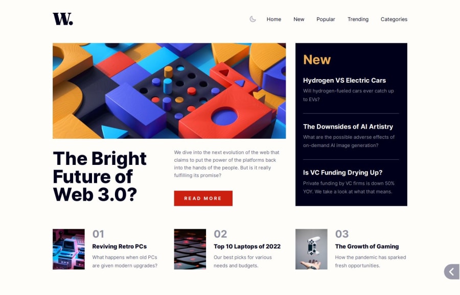
Design comparison
SolutionDesign
Solution retrospective
What are you most proud of, and what would you do differently next time?
- The solution is pixel perfect but for some reason the screenshot leaves a blank space at the bottom. 🤷🏻♂️
- Dark theme with local storage.
Any feedback is welcome. Thank you.
Please log in to post a comment
Log in with GitHubCommunity feedback
No feedback yet. Be the first to give feedback on Fer's solution.
Join our Discord community
Join thousands of Frontend Mentor community members taking the challenges, sharing resources, helping each other, and chatting about all things front-end!
Join our Discord
