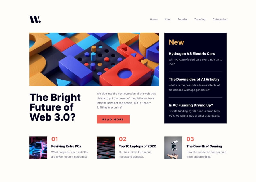
Design comparison
Solution retrospective
I struggled a bit to reproduce correctly margins and paddings as everything is slightly wider.
I would appreciate some comments and thoughts! :)
Community feedback
- @F4eNnPosted about 1 year ago
Great job Małgorzata! 😄
it almost looks the same, but I believe it can be improved a bit by... '😌
-
Adding, among other things,
aria-labelattributes to links or buttons that are icons or pictures makes interaction easier for people with disabilities. -
Additionally, I highly recommend using color picking tools like PowerToys and paying attention to the combination of hover and transition properties.
Marked as helpful0@gosiastPosted about 1 year agoHi Mateusz! @F4eNn I appreciate your comments :) I will try it out!
I didn't know the PowerToys tool, thanks for the recommendation!
0 -
Please log in to post a comment
Log in with GitHubJoin our Discord community
Join thousands of Frontend Mentor community members taking the challenges, sharing resources, helping each other, and chatting about all things front-end!
Join our Discord
