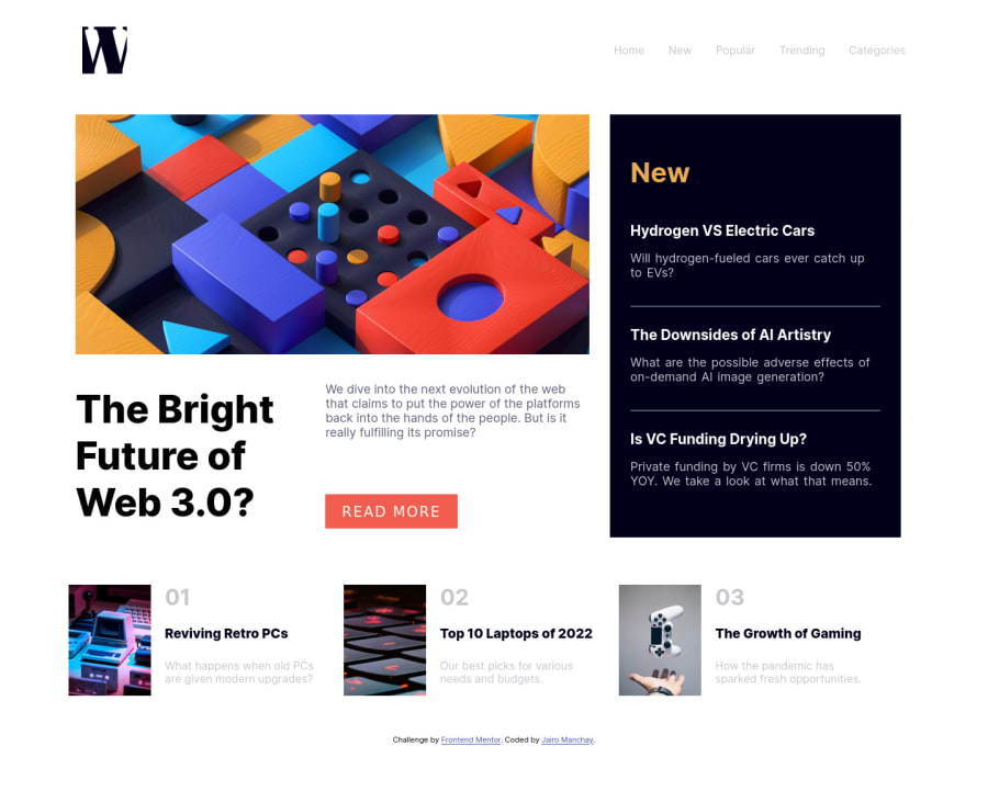
Design comparison
Solution retrospective
Good project I did with CSS, JS and HTML, if you open the code and could improve it, happy to read
Community feedback
- @catherineisonlinePosted almost 2 years ago
Hello 🙌🏻 Your solution looks great however here are a couple of things you can improve which I hope will be helpful! 😎
The way you are changing images with id desktop and mobile looks interesting but there is a more simple way to do that. You can either simply set it in CSS using media query. So let's say you want to use a mobile image when the screen width is less than 700px you do
@media screen and (max-width: 700px) {
image {
content: url("/assets/images/image-web-3-mobile.jpg")
}

}
Or there is another way without media queries and also you can set several images for different screens. I recommend reading it here and experimenting with this, I have started using it recently, and sounds like a great solution as well:
https://developer.mozilla.org/en-US/docs/Learn/HTML/Multimedia_and_embedding/Responsive_images
Make sure to use rem (relative length value) or em units instead of pixels for the purpose of “respecting the user preferences”, to say so. It makes the “sizes” of the website fluid according to the zoom/sizes set by the user. I see you do use it but you use px, em, and rem at the same time. Was it intended?
You can read more about it here: https://www.freecodecamp.org/news/what-is-rem-in-css/
Marked as helpful0@JairoManchayPosted almost 2 years ago@catherineisonline Thanks for recommend the use of the background - imagen in devices mobile, and the sizes in rem, em and px, I was testing the use of each of them to see how it was, but I'll read the urls you gave me to learn more about css thanks :)
0
Please log in to post a comment
Log in with GitHubJoin our Discord community
Join thousands of Frontend Mentor community members taking the challenges, sharing resources, helping each other, and chatting about all things front-end!
Join our Discord
