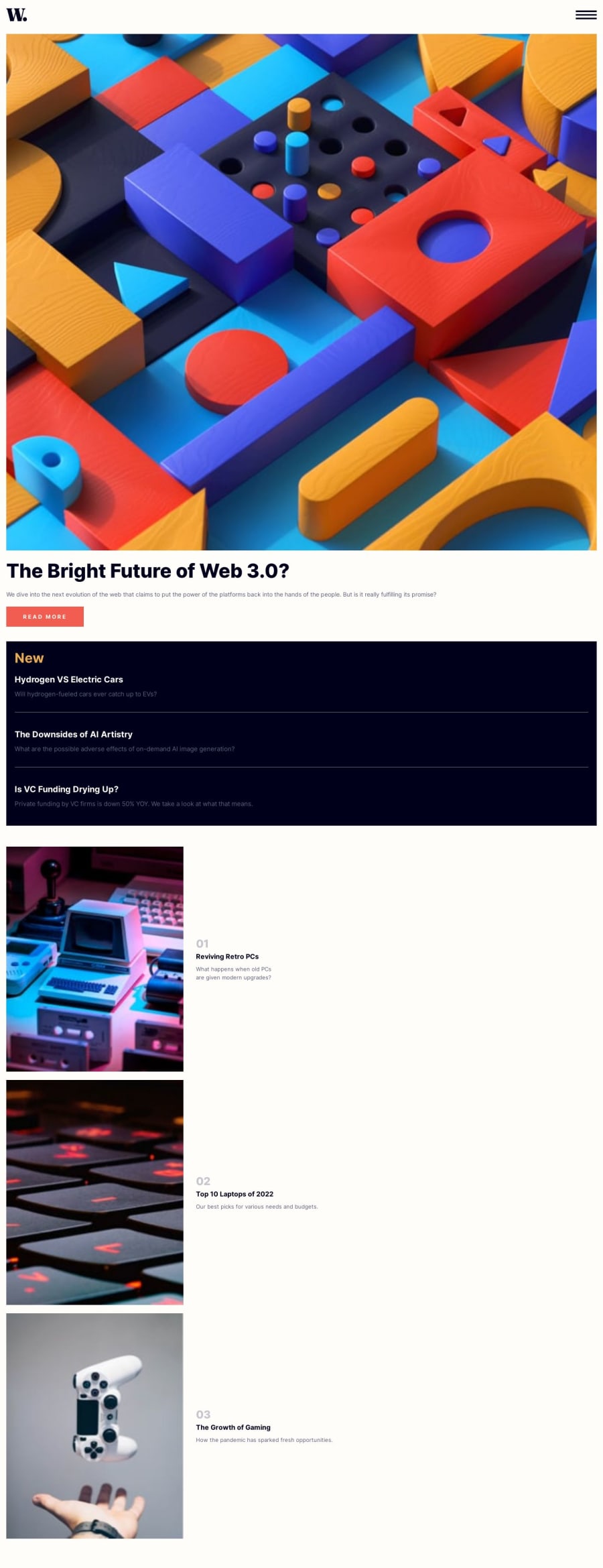
Design comparison
Community feedback
- @FrantiskaAliPosted over 1 year ago
Hello,looks really great on phone :) However maybe you should consider trying to do layout for desktop too. Just because u use element <aside> it will not position itself to the side. I would recommend wrapping everything under header into element <main> and you can position its childreb element using flexbox or grid. Old fashion way would be float. I am addibg some links about flexboc and grids..https://css-tricks.com/snippets/css/a-guide-to-flexbox/ ,..https://css-tricks.com/snippets/css/complete-guide-grid/ . . Also for the buttons and navvin desktop if you want color or anything changed when mouse is hovering => .text:hover {style on hover}. Happy coding:)
Marked as helpful1
Please log in to post a comment
Log in with GitHubJoin our Discord community
Join thousands of Frontend Mentor community members taking the challenges, sharing resources, helping each other, and chatting about all things front-end!
Join our Discord
