Design comparison
SolutionDesign
Solution retrospective
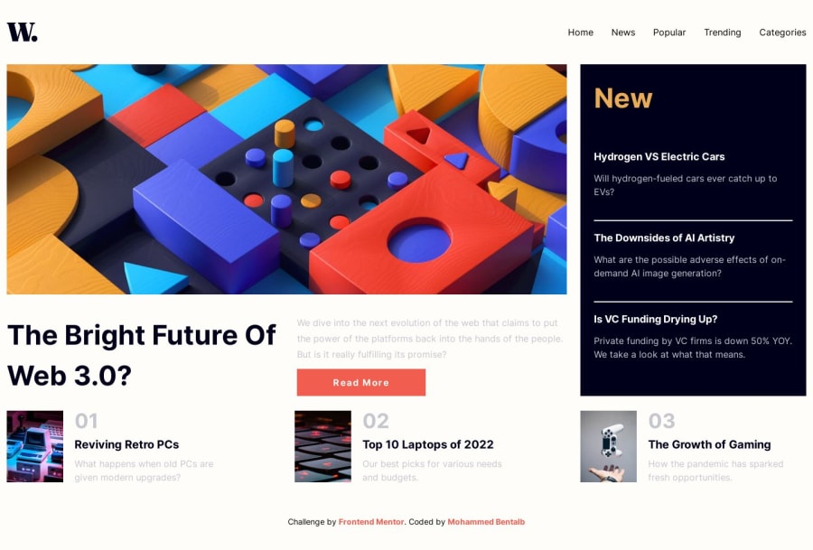
It's not that accurate since I don't have the exact sizes / Figma design but it looks good and responsive ass it should be
Community feedback
- @TomasPereira-DevPosted about 1 year ago
Hey!, what's up?, it was a close attempt! good for you. A way to improve this is adding a max-width to the texts using the ch unit, with that you can make the brakes of line that are in the original design, 1 ch = 1 zero(0) character in the font you choose, imagine every character like zeros when you use it, here is more info about it here is more info about it Good luck!
Marked as helpful1@MohammedBentalbPosted about 1 year agoI'll definitely put it into use next time, thank you @TomasPereira-Dev
1
Please log in to post a comment
Log in with GitHubJoin our Discord community
Join thousands of Frontend Mentor community members taking the challenges, sharing resources, helping each other, and chatting about all things front-end!
Join our Discord