Submitted over 2 years ago
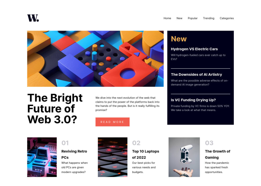
News Homepage using CSS Grid
#sass/scss#node
P
@Odiesta
Design comparison
SolutionDesign
Solution retrospective
-
I create a separate navigation for snaller screen. I hide it in larger screen and show it in smaller screen. Is it a better way of doing it🤔.
-
The row of image in bottom doesn't align well in medium screen like in 800px width. I use flexbox for the text, set the image width according to screen size but it's not maximal. Any solution for this?
Community feedback
Please log in to post a comment
Log in with GitHubJoin our Discord community
Join thousands of Frontend Mentor community members taking the challenges, sharing resources, helping each other, and chatting about all things front-end!
Join our Discord
