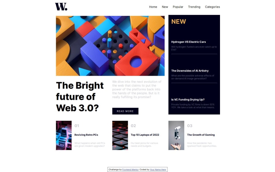
Design comparison
SolutionDesign
Community feedback
- P@tunaertenPosted 4 months ago
Congratulations on completing this challenge!
- Using
ulandlifor navigation elements is a more commonly practiced method.
You can structure your navigation like this:
<nav> <ul> <li> <a class="pad-ele">Home</a> <a class="pad-ele" href="#new">New</a> <a class="pad-ele">Popular</a> <a class="pad-ele">Trending</a> <a class="pad-left-ele" href="#category">Categories</a> </li> </ul> </nav>- You can write this in a much simpler way using toggle like this.
const toggleNav = () => {
    mob_nav.classList.toggle("active");
};
In this way, when the button is clicked, the active class is added, and on the next click, the active class is removed.
- You can also add it to the navigation or links you
hoverover.
cursor:pointer- I would also recommend making a few additions from an accessibility perspective. You should definitely add ARIA attributes for screen reader compatibility, and the website should be navigable via keyboard. You can read the details here.
Marked as helpful1 - Using
Please log in to post a comment
Log in with GitHubJoin our Discord community
Join thousands of Frontend Mentor community members taking the challenges, sharing resources, helping each other, and chatting about all things front-end!
Join our Discord
