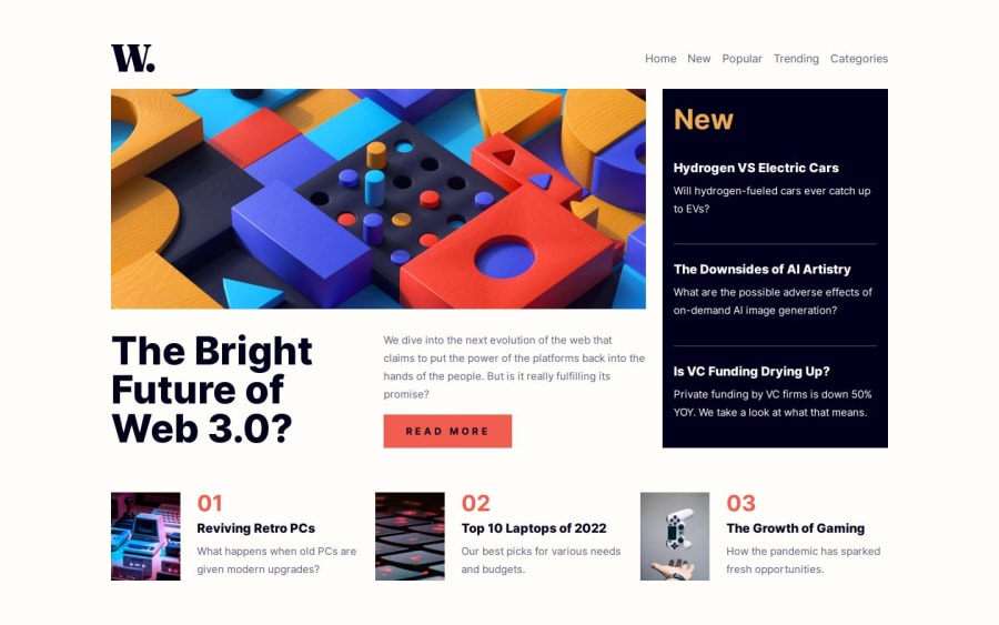
News Homepage - HTML, CSS, JS w/ Accessibility & BEM
Design comparison
Solution retrospective
I'm open to all and any advice on how I can improve my code!
Community feedback
- @AdrianoEscarabotePosted 5 months ago
Hi Dominic P, hope you're doing well! I loved how your project turned out, but I’ve got a few suggestions that could be useful:
I noticed that you used a button in which case the best option would be an a, because in my head when a person clicks on a button written
Read More, he is not confirming a form, or something like, it will be redirected to another page, to Read More about!to solve this problem do this:
<a href="/">Read More</a>The rest is fantastic.
Hopefully, you'll find it helpful. 👍
Marked as helpful0
Please log in to post a comment
Log in with GitHubJoin our Discord community
Join thousands of Frontend Mentor community members taking the challenges, sharing resources, helping each other, and chatting about all things front-end!
Join our Discord
