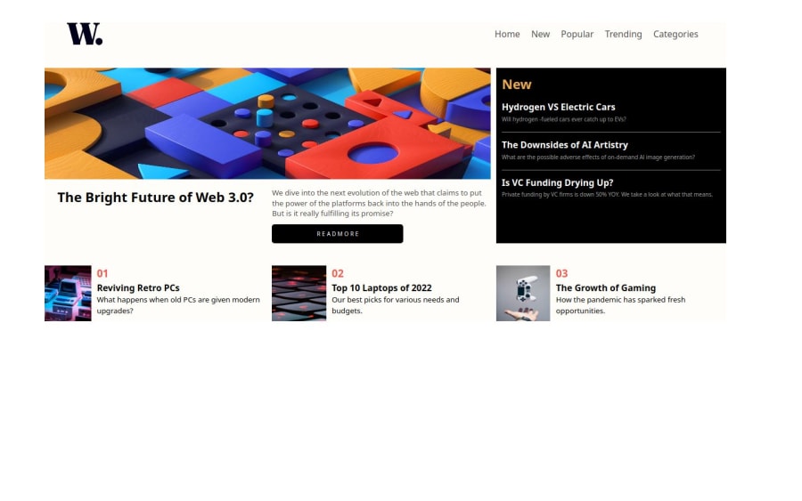


Design comparison
SolutionDesign

Solution retrospective
What specific areas of your project would you like help with?
Help me with setting the menu for nav elements in mobile view
Community feedback
- @khatri2002Posted about 2 months ago
Hi! Since you wanted to know how a navigation bar can be created for mobile view, here's a step-by-step approach:
- Create a Button for the Mobile Menu
- Add a button with an icon-menu image inside the
navelement, positioned after thedivwith classaTagDiv. - The button will act as the trigger to open/close the navigation bar.
- Add a button with an icon-menu image inside the
<nav> <div class="aTagDiv"> ... </div> <button class="menu-btn"> <img src="./icon-menu.svg" alt="menu icon" /> </button> </nav>- Initial Button Styles
- Hide the button on desktop devices and align it properly for mobile view.
.menu-btn { margin-left: auto; display: none; /* Hidden by default for larger screens */ }- Handle Mobile-Specific Breakpoint
- Use media queries to adjust the styles for mobile devices.
- For the navigation drawer (
aTagDiv), set it as a fixed element on the right side of the screen. Initially, it will be hidden usingtransform: translateX(100%).
@media screen and (max-width: 768px) { .menu-btn { display: block; /* Show the button on mobile */ z-index: 20; /* Ensure it's on top of the navigation drawer */ } .aTagDiv { position: fixed; background-color: white; height: 100%; width: 70%; /* Adjust the width of the drawer */ top: 0; right: 0; flex-direction: column; z-index: 10; /* Below the button */ padding-top: 4rem; transition: transform 0.4s; /* Smooth open/close transition */ transform: translateX(100%); /* Initially hidden */ } }- Toggle the Navigation Drawer on Button Click
- Add an
activeclass to the navigation drawer (aTagDiv) when the button is clicked. This will slide it into view. - Also, change the menu icon to a close icon in the button.
- Add an
.aTagDiv.active { transform: translateX(0); /* Slide into view */ }- JavaScript to Handle Click Events
- Add a JavaScript snippet to toggle the
activeclass and change the button's icon dynamically.
- Add a JavaScript snippet to toggle the
This is a basic implementation idea for creating a responsive mobile navigation bar. Feel free to experiment with CSS values and animations to align with your design goals.
Let me know if you need further guidance!
Keep going! 🚀
Marked as helpful1 - Create a Button for the Mobile Menu

Please log in to post a comment
Log in with GitHub
Join our Discord community
Join thousands of Frontend Mentor community members taking the challenges, sharing resources, helping each other, and chatting about all things front-end!
Join our Discord