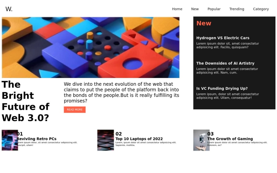
Design comparison
Solution retrospective
do say me how is my design I have not worked for responsive now..will try to implement next time.
Community feedback
- @Kamasah-DicksonPosted about 2 years ago
Hi there👍 you really did great. keep it up but these are some tips you can use next time.
-
Don't use units such as px and percentages for parent containers but instead I recommend rem units for font sizes and widths and em units for paddings. I don't recommend px units because they cause a lot of problems when people zoom in their browsers and there are a lot of reasons. You can learn more about units at YouTube. Check Kevin Powell and coder coder
-
Also I would really recommend that you take your time and learn flexbox and grid into more details don't rush take your time and believe in the process.
Besides you really did a very great job👍 Happy coding👍
Marked as helpful2 -
Please log in to post a comment
Log in with GitHubJoin our Discord community
Join thousands of Frontend Mentor community members taking the challenges, sharing resources, helping each other, and chatting about all things front-end!
Join our Discord
