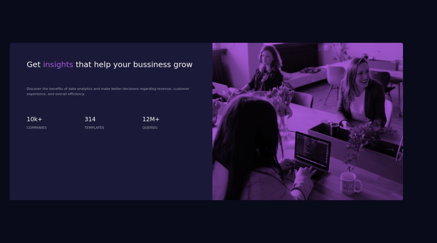
Design comparison
Community feedback
- @correlucasPosted over 2 years ago
👾Hello Franchiko, congratulations for your new solution!
I saw that you've done your solution with a framework and this is amazing.
Your solution is missing only two things, the alignment and the colors/font-sizes. To have the correct colors for this challenge you can check the file
style-guide.mdto have all these values.body { display: flex; min-height: 100vh; align-items: center; justify-content: center; }To have the same overlay effect for the image, use instead:
img { mix-blend-mode: multiply; `` `
👋 I hope this helps you and happy coding!
0 - @MahdiSohailyPosted over 2 years ago
Hello dear, you have done a great job, but it looks like your solution image is not looking the exact same as the challenge. for this, you need to give a pink background to the container of the image and apply the following style to your image.
mix-blend-mode: multiply;
  opacity: 0.8;
if it was helpful, mark my comment as helpful.
0
Please log in to post a comment
Log in with GitHubJoin our Discord community
Join thousands of Frontend Mentor community members taking the challenges, sharing resources, helping each other, and chatting about all things front-end!
Join our Discord
