


@dongmo-shu
Posted
Nice. That is a great attempt at the challenge.
I don't recommend having the site styling inside of the HTML code. Create a CSS file, insert the styling, and link the file to your HTML code. You can do that by adding <link rel="stylesheet" href="filename.css"> into the <head> section. Make sure both files are in the same folder.
Next up, the body needs to be at the centre of the page. there are many ways to do it. This is the most efficient I found.
body{
    background-color: hsl(217, 54%, 11%);
    height: 100vh;
    display: flex;
    align-items: center;
    flex-direction: column;
    justify-content: center;
    font-family: "Outfit", sans-serif;
}
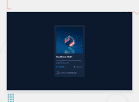
The hover effect on the image, Our Equilibrium collection promotes balance and calm. and Jules Wyvern is missing.
For the hover effect on the image, and adding the eye icon, here is my take.
HTML
            <div class="equilibrium">
                <img class="image-equilibrium" src="../images/image-equilibrium.jpg" alt="equilibrium-image">
                <div class="overlay">
                    <img class="icon-view" src="../images/icon-view.svg" alt="view-icon">
                </div>
            </div>
CSS
.equilibrium{
    position: relative;
    overflow: hidden;
    max-height: 280px;
}

.image-equilibrium{
    height: 100%;
    border-radius: 10px;
}

.overlay{
    background: hsla(178, 100%, 50%, 0.4);
    position: absolute;
    top: 0;
    left: 0;
    display: flex;
    align-items: center;
    justify-content: center;
    height: 100%;
    width: 100%;
    opacity: 0;
    transition: .5s ease;
    border-radius: 10px;
}

.overlay:hover{
    opacity: 1;
}

.icon-view {
    position: absolute;
    top:42%;
    left: 42%;
    transition: 0.3s opacity;
}
Make sure to make any modifications necessary.
I hope this is helpful. If you have any questions, feel free to ask.
Marked as helpful
@Eleniyan-code
Posted
I am grateful for the feedback, I will implement the upgrade, thanks for taking your time to go through my solution @Singraft
