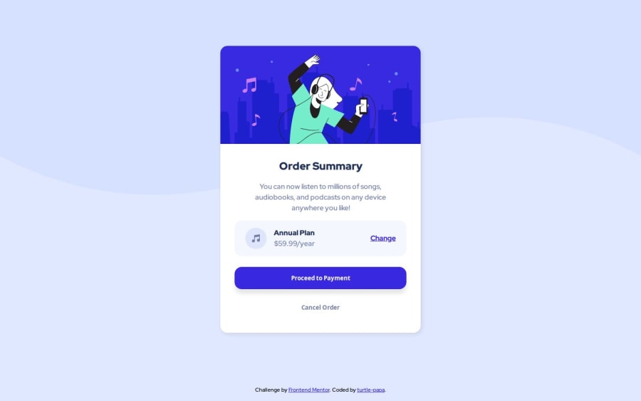
Design comparison
SolutionDesign
Community feedback
- @Islandstone89Posted 9 months ago
Hi there, well done!
A few tips:
HTML:
- The image and icon are both decorative, which means their alt text should be empty:
alt="".
CSS:
-
I like to add
padding: 1remonbody, to make sure components don't touch the edge on small screens. -
The card should not have a fixed width. Instead, give it a
max-widthof around20rem.
0 - The image and icon are both decorative, which means their alt text should be empty:
Please log in to post a comment
Log in with GitHubJoin our Discord community
Join thousands of Frontend Mentor community members taking the challenges, sharing resources, helping each other, and chatting about all things front-end!
Join our Discord
