Design comparison
Solution retrospective
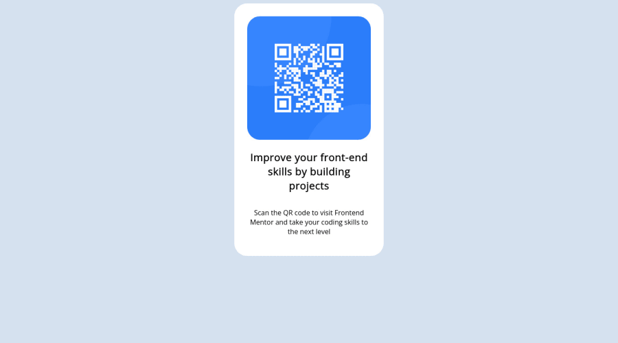
Had trouble trying to figure out how to center the qr component into the middle of the browser. Wanted to see people's solutions.
Community feedback
- @Valentin-DrPosted almost 2 years ago
Hello !
In order to center an element, one of the possible ways is to use flexbox. But, in order to do that, you'd have to set the width and height attributes of the element's parent, which is the body.
body {
    margin: 0;
    width: 100vw;
    height: 100vh;
    display: flex;
    justify-content: center;
    align-items: center;
}
Using flex on the body, along with
justify-content: centerandalign-items: centerwill center its child(s) both horizontally and vertically. The reason we have to set the height and the width is because this will center child(s) depending of the available space it has.Once done, your card will be centered on your page.
Now, for simplicity sake, you can use
.container {
    padding: 30px;
    background-color: white;
    border-radius: 20px;
    width: 20%;
}
I've put width at 20% instead of vw, since our body now already takes 100vw, but you could put a fixed width with rem unit instead like
width: 20rem;which looks better in my opinion but depends on what you need to do with the project.After that, I modified this part of your CSS :
.qr-code {
  // border: 30px solid white;
  // background-color: white;
  // border-radius: 30px;
  // margin: auto;
  width: 100%;
  text-align: center;
}
Since I've added a padding on the .container, along with a background-color and border-radius, you don't need to add them in here anymore. The
width: 100%makes it take all the available width, minus the padding of the parent.And I've also done the same with the image:
.image {
  width: 100%;
  border-radius: 30px;
}
Also a couple last things, images MUST have an alt attribute, which allows to display text in case of broken image, or if read by a screen reader. If the image is not important for your page content, leave it empty, but in that case you could add something like
alt="Frontend Mentor QR code"Replace the h2, with an h1, since it is the main "title" of the page
Overall, it's a great start ! You understood the project well, I hope you had fun making it, it's the most important !
Have fun coding
0 - @pfigzPosted almost 2 years ago
To add to @rzceoffical's comment: In order to vertically center an element, the container must have a height value. Adding
height: 100vh;to your body element will make the height equal to 100% of the view height. You can then center your element using either grid or flexbox.You also applied auto margin to your .qr-code class, which created a larger gap than in the design. I would personally add padding to the .container element in this case. Try different values to see what works.
You can also go to this link to see different ways to style your text (font): https://www.w3schools.com/css/css_font_size.asp. Try to incorporate some of these styles to get closer to the design template.
0 - @Mediteran2910Posted almost 2 years ago
I was doing it with flex-box.. Check my code https://github.com/Mediteran2910/HTML-CSS-QR-CODE
0 - @rzceofficalPosted almost 2 years ago
body {
 display: grid;
 place-items: center;

 height: 100svh;
}
Thats what a normally do But it should only contain 1 element to be centered. Container or Wrapper would be a good name
0
Please log in to post a comment
Log in with GitHubJoin our Discord community
Join thousands of Frontend Mentor community members taking the challenges, sharing resources, helping each other, and chatting about all things front-end!
Join our Discord
