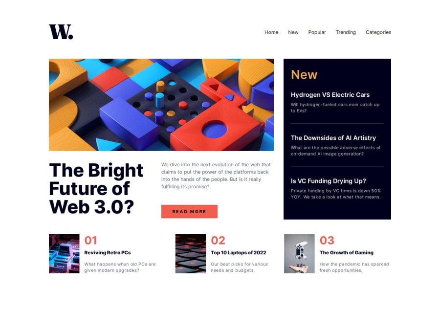
new homepage app with next


Design comparison

Solution retrospective
I am particularly satisfied with having deepened my knowledge of Next.js and its features, especially in the use of components and routing management. Regarding areas for improvement, I could have better planned the layout structure with CSS Grid from the start, instead of making subsequent adjustments. Next time, I will dedicate more time to the layout design phase before starting to code.
What challenges did you encounter, and how did you overcome them?The main challenge was managing the responsive layout using a combination of Grid and Flexbox, particularly for positioning the news component and the main image. I overcame these difficulties by studying the CSS Grid documentation more thoroughly and making several attempts until finding the best solution. The experience taught me the importance of a good understanding of CSS layout systems and how to combine them effectively.
Community feedback
- @khatri2002Posted 3 months ago
Hi! The developed solution looks good! Excellent work!
The primary objective of this challenge is to achieve precise alignment of each news card, especially in desktop resolution. Let's address the key alignment requirements:
- The
Top 10 Laptops of 2022card should be aligned directly below theRead Morebutton. - The
The Growth of Gamingcard should be aligned directly below theNewcard.
Currently, both of these alignments are not maintained.
You’ve divided the news section into two parts:
- Upper part (grid): The
web-3card spans multiple columns, with an inner grid used for its content. - Lower part (flex-box): The remaining news cards are arranged using a flex-box layout.
While this approach works to an extent, managing consistent gaps across grids, flex-boxes, and their inner elements can be challenging and tricky to maintain.
To simplify the structure and ensure perfect alignment, you can create a single grid layout with 3 columns for the entire news section.
- Treat every card or section as an individual grid item.
- By doing this, you can directly manage consistent gaps between all grid items without relying on inner grids or flex-boxes.
- This approach ensures the required alignment is achieved easily and avoids complexity in gap management.
Benefits of This Approach:
- Simplified Layout: Eliminates the need for nested grids or flex-boxes.
- Consistency: Ensures uniform gaps across all cards.
- Ease of Maintenance: Makes future adjustments or modifications straightforward.
Overall, this is a great solution! With the suggested refinement, the alignment and layout will be even more polished and easier to manage. Keep up the amazing work! 🚀
Marked as helpful1P@Smailen5Posted about 1 month agoHi @katri2002,
Thank you for your detailed feedback! I really appreciate the suggestion—I hadn’t noticed the alignment issue before.
I’ve created an issue with your comment so I can keep track of it. Right now, due to how my portfolio site is structured, I can't update the project without affecting its chronological order (since I use the latest commit to organize them). However, once I update the way projects are sorted to maintain their original order regardless of modifications, I’ll definitely revisit this and work on improving the layout.
Thanks again for your help! 🚀
I've also opened an issue in my repository and tagged you there so you can check it out. Feel free to follow the progress or add any further suggestions! 🚀
Issue link: https://github.com/Smailen5/Frontend-Mentor-Challenge/issues/17
0 - The

Please log in to post a comment
Log in with GitHub
Join our Discord community
Join thousands of Frontend Mentor community members taking the challenges, sharing resources, helping each other, and chatting about all things front-end!
Join our Discord