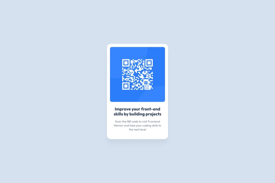
Design comparison
Community feedback
- @talxdoPosted about 1 month ago
This HTML and CSS code has several key areas for improvement. Firstly, the current structure relies heavily on
<div>elements without appropriate semantic tags. It is recommended to use semantic elements like<header>,<nav>,<main>, and<footer>to enhance document structure. Secondly, the code lacks proper accessibility features; all images should have descriptive alt attributes, and headings should be used correctly, starting with<h1>for the main title. Additionally, keyboard navigation and screen reader compatibility should be considered.In terms of responsive design, while the CSS includes media queries, the layout may still be too complex for smaller screens. It is essential to ensure that elements stack appropriately on smaller devices and to test the design across various screen sizes. The CSS is generally well-structured, but there are areas for improvement in code readability; consistent naming conventions for classes and IDs should be used, and related styles should be grouped logically with comments added for clarity.
Lastly, the design significantly diverges from the intended simple QR code component and resembles a Netflix clone. It is crucial to revisit the original design requirements, simplify the layout to focus on the QR code functionality, and remove unnecessary features. In conclusion, the implementation needs to prioritize semantic HTML, accessibility, and a simplified design that aligns with the original intent of creating a QR code component, making the final product more effective and user-friendly.
0
Please log in to post a comment
Log in with GitHubJoin our Discord community
Join thousands of Frontend Mentor community members taking the challenges, sharing resources, helping each other, and chatting about all things front-end!
Join our Discord
