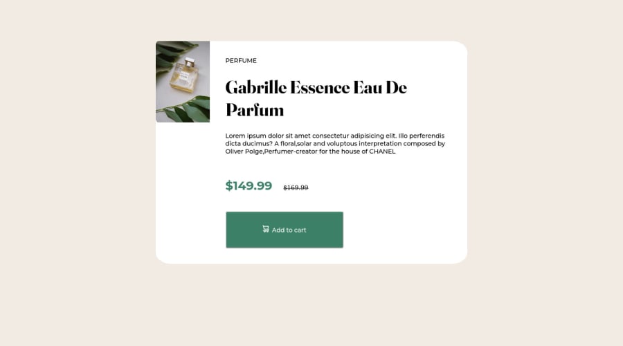
Not Found
Not Found
Not Found
Not Found
Not Found
Not Found
Not Found
Not Found
Not Found
Not Found
Not Found
Not Found
Not Found
Not Found
Not Found
Not Found
Not Found
Not Found
Not Found
Not Found

Submitted

Naive Solution using CSS

Mohak Muskanโ€ข 10

@mohak-muskan

Desktop design screenshot for the Product preview card component coding challenge

This is a solution for...

  • HTML
  • CSS
1newbie
View challenge

Design comparison


SolutionDesign

Solution retrospective


I only came up with a desktop preview and not for mobile. Mostly because it lacks responsiveness. Any tip on how can I work on that?

Community feedback

Lucas ๐Ÿ‘พโ€ข 104,440

@correlucas

Posted

๐Ÿ‘พHello Mohak, congratulations for your solution!

I saw that you've add all the content, now we've only to give it some styling.

First you need to move the properties for the component from body to another <div> or <main> if you prefer, in this case is better to use grid because its simple. To create the component with two columns all you need is display: grid max-width: 900px and grid-template: columns; doing that you'll have a two columns component and each div under this component will have 450px.

To manage the mobile version you'll need media queries, I'll let you some links about grid and media queries this way you can see the documentation and apply it:

GRID: https://css-tricks.com/snippets/css/complete-guide-grid/

MEDIA QUERY: https://www.w3schools.com/css/css_rwd_mediaqueries.asp

Hope it helps and happy coding!

Marked as helpful

0

Mohak Muskanโ€ข 10

@mohak-muskan

Posted

@correlucas Thanks for your time. I will definitely look up the resources you provided.

0
Remtaineโ€ข 360

@remtaine

Posted

Looks pretty good! Regarding responsiveness, look into either Flexbox or Grid for this. Both can work, though I'd suggest Flexbox since all you'd have to do then is change the flex-direction based on screen-size through media queries. Flexbox is better for lines (a single row or column), Grid is better for work with the x and y-axis at the same time.

On my desktop browser (Firefox), there's also the trouble of the image not filling in the height. It's just in the upper left corner. Proper usage of Flexbox properties like flex-grow, flex-shrink, and flex-basis can fix that.

All in all, a great effort! I'm sure once you apply the changes it'll look even better!

0

Please log in to post a comment

Log in with GitHub
Discord logo

Join our Discord community

Join thousands of Frontend Mentor community members taking the challenges, sharing resources, helping each other, and chatting about all things front-end!

Join our Discord