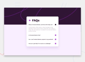
Design comparison
SolutionDesign
Solution retrospective
What are you most proud of, and what would you do differently next time?
de ter conseguido usar js
What challenges did you encounter, and how did you overcome them?de poder fazer a imagem de plus e minus mudar, eu consegui fazer depois com outra alternativa que era fazer com textContent.
Community feedback
- @EmazsPosted 6 months ago
Hello Letícia, I hope you are well. I liked how you made the page. I noticed a few things that would be good to consider:
- The page design is not responsive, meaning it won't display correctly on mobile devices because some elements are out of width.
- The answers to the questions in the textarea are missing.
- It would be good to use a div or section to separate the questions and apply styles.
Marked as helpful0
Please log in to post a comment
Log in with GitHubJoin our Discord community
Join thousands of Frontend Mentor community members taking the challenges, sharing resources, helping each other, and chatting about all things front-end!
Join our Discord
