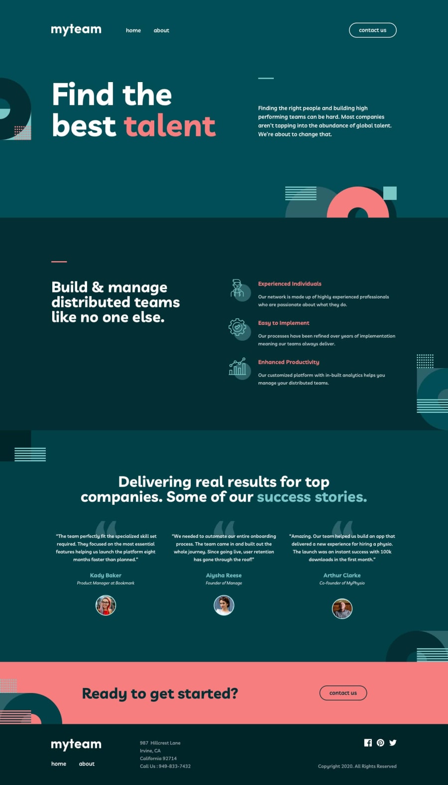
Design comparison
SolutionDesign
Solution retrospective
Howdy,
Just wanted to mess about with this project, mostly in vanilla JS. Creating a bunch of cards from an array of objects, injecting header/footer with JS, etc. I chose this project for it since it was only 3 pages large, not quite sure it belonged in the advanced section.
I'll be doing some basic code cleanup in the next few days just to see how many mistakes I've made but the overall result will remain identical.
Small note: Arthur's positioning seems way off when comparing to the design, but the netlify link will show you that's not the case. No clue how to fix that bug 😅
Happy coding 😁
Community feedback
Please log in to post a comment
Log in with GitHubJoin our Discord community
Join thousands of Frontend Mentor community members taking the challenges, sharing resources, helping each other, and chatting about all things front-end!
Join our Discord
