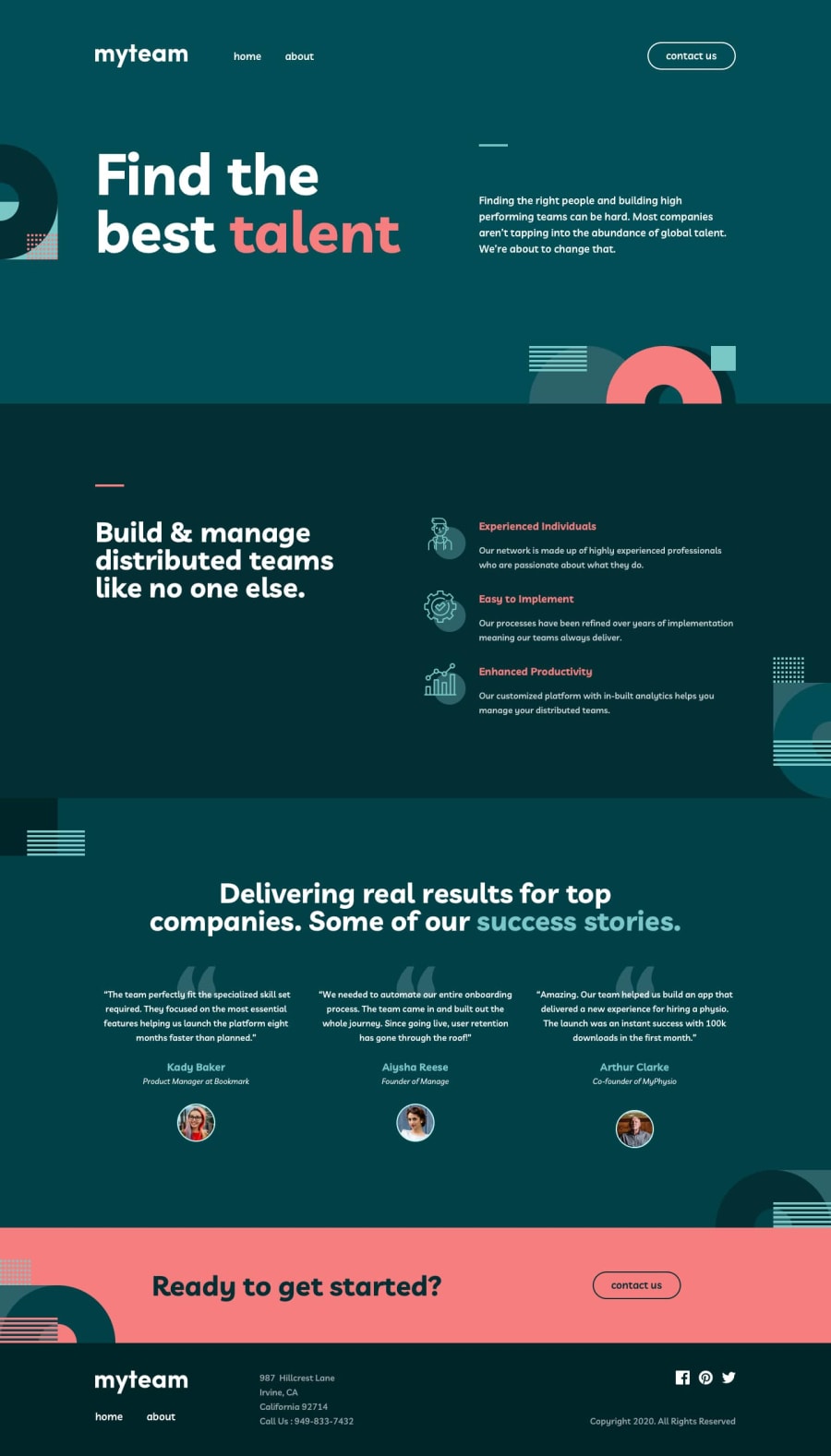
Design comparison
SolutionDesign
Community feedback
- @shashiloPosted over 4 years ago
Good to see someone else taking on this difficult challenge. Completing it alone is a great achievement.
Looking over the implementation closer, here are some things I saw that can improve:
- Images. The background images and some implemented images are in the wrong place or the aspect ratio is incorrect.
- Fonts. You imported Livviv, but not the specific weights. Therefore, the design looks off because it's not using the right
font-weights. - Using Firefox, you can clearly see some unnecessary overflows. You have
*with the style ofoverflow-x: hidden, but thenoverflow-yis not visible. I highly recommend you to not use overflows unless you need it. In this case, you just need to position the background image in the correct place without the overflow. - On mobile and tablet screens, there's some incorrect location of images, font-weight, line-height, etc.
- The overall content width is an issue. It's set at
width: 80%which defeats the style guide's specs. It also effects tablet and mobile screens. Tablet is huge spacing on the left and right side because it's only using 80% of the viewport width. - Overall, paying attention to the details of the design. I know these are nit-picky, but I've worked with many great designers and they are very pixel perfect.
2
Please log in to post a comment
Log in with GitHubJoin our Discord community
Join thousands of Frontend Mentor community members taking the challenges, sharing resources, helping each other, and chatting about all things front-end!
Join our Discord
