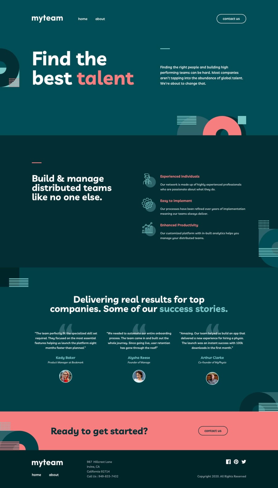
myteam multipage website with NextJS and Tailwind
Design comparison
Solution retrospective
I just completed my first Advanced challenge 🎉
Any feedback is appreciated.
This was my first time using NextJS and my experience has been positive.
It was the second project where I used Tailwind. I have to say I didn't think I would like it much before I started to use it. With all the long ugly class names, no separation of concerns, ... But I have to say that I have come around. Here is what I like the most about it:
- No indirection or context switching. I can see what elements have which styles and I don't need to switch between html and css files, scrolling up and down to see where the styles for certain element are declared.
- Not having to come up with names for each element you want to style.
- Using the prettier plugin classes are neatly arranged and easier to visually parse.
Overall I think using Tailwind I can develop much faster.
Community feedback
- @reaperxyndromePosted 11 months ago
Try using clamp for fluid design. When you use clamp, you are able to control flexible sizes for different screens based on vw. Clamp is to make sure the values stay between a range of minimum and maximum, while giving a middle function to calculate the value. How to use clamp? https://developer.mozilla.org/en-US/docs/Web/CSS/clamp
Another thing that might be useful is to add animations, either to import it or create one yourself. I saw another solution that used animations and it looks so good.
Marked as helpful0@david-tejadaPosted 11 months agoThanks! I have use clamp in the past and you are right it could have improved the code.
Animations are also nice to have when done properly. I have done some here and there but I guess I wasn't focusing on that for this one.
0
Please log in to post a comment
Log in with GitHubJoin our Discord community
Join thousands of Frontend Mentor community members taking the challenges, sharing resources, helping each other, and chatting about all things front-end!
Join our Discord
