Design comparison
SolutionDesign
Solution retrospective
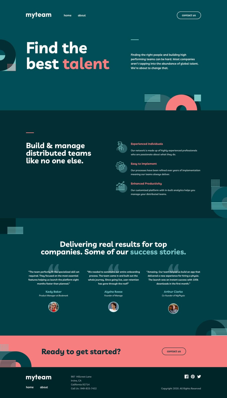
A good challenge that caused me to stop and really think about this site's layout and how I could structure the HTML to easily transition between mobile, tablet and desktop.
The background images on each sections of the 3 page website also proved a bit of a challenge at times, but I managed to get them as close as I could to the design files.
Community feedback
Please log in to post a comment
Log in with GitHubJoin our Discord community
Join thousands of Frontend Mentor community members taking the challenges, sharing resources, helping each other, and chatting about all things front-end!
Join our Discord
