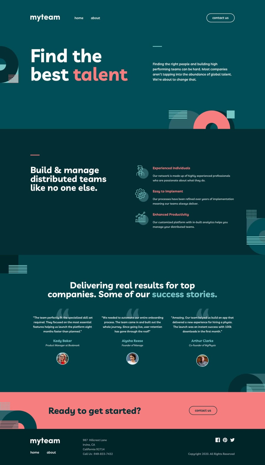
Design comparison
Community feedback
- @jonathan401Posted almost 2 years ago
Wonderful solution 🎉🎉. I really love your solutions. I have an observation. In the about page, where a user clicks on the plus icon to reveal the information about a particular team member, I noticed the transition was not that smooth and it took quite a while. That's the only thing I noticed. Other than that, your solution is amazing 🎊🎊
Marked as helpful1@karolbanatPosted almost 2 years ago@jonathan401 Thanks for the comment 😊. Actually took your advice and adjusted the animation. The delay in transition was probably because of the fade-in animation going from 0 opacity.
1@jonathan401Posted almost 2 years ago@karolbanat thankful you found it helpful. I checked the live site of your solution on my desktop and its beautiful. You're one of the guys around here that I really look up to :). Thanks for being an inspiration.
1
Please log in to post a comment
Log in with GitHubJoin our Discord community
Join thousands of Frontend Mentor community members taking the challenges, sharing resources, helping each other, and chatting about all things front-end!
Join our Discord
