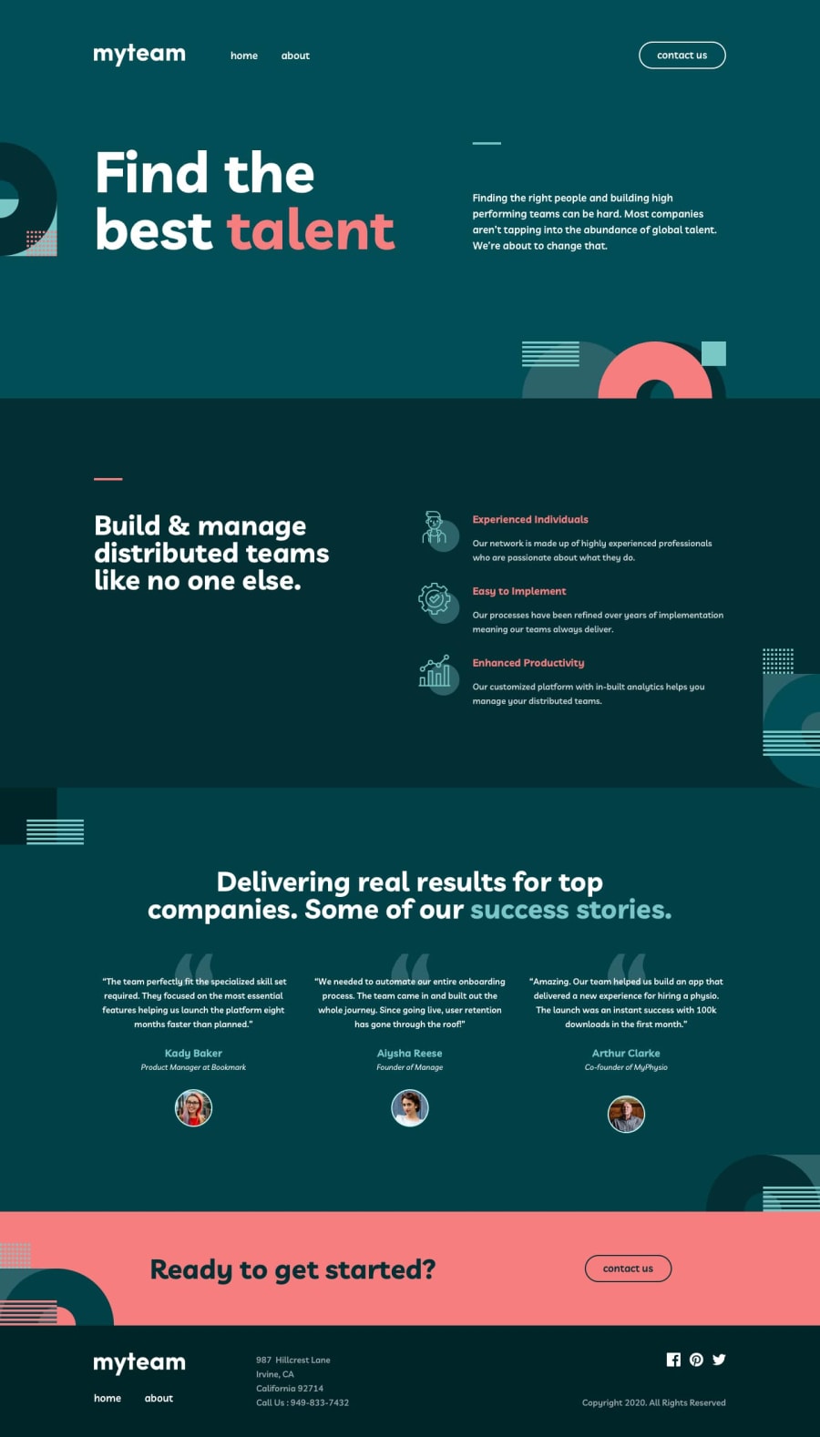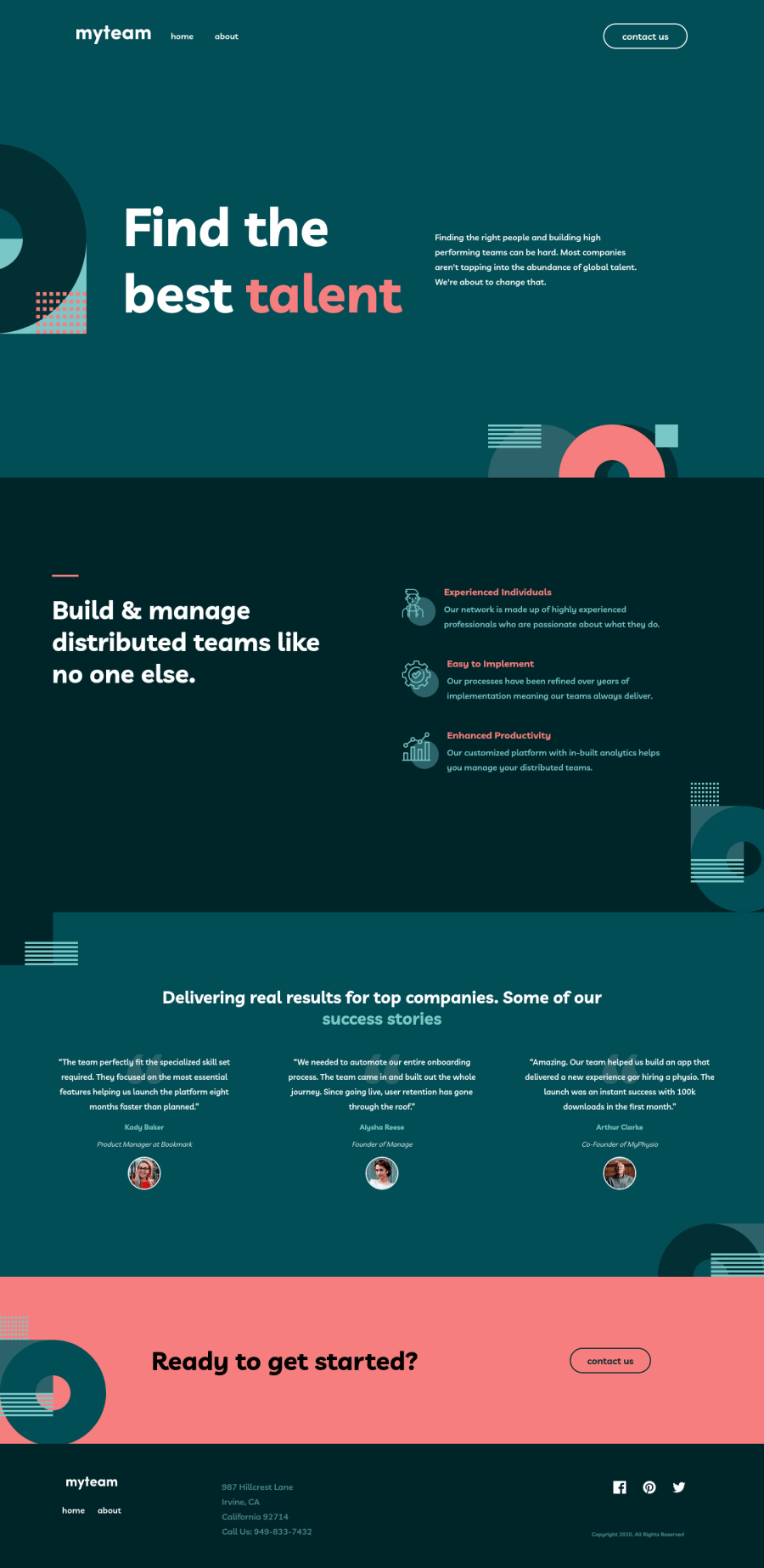
MyTeam Multi-Page. Built with SCSS/SASS & JavaScript
Design comparison
Solution retrospective
I've been enjoying creating multi-pages. This project was built using a mobile first approach, I've recently found it to be a more seamless approach when developing through different viewports. The background images was very good practice as it required multiple bg-images, which I realized added a lot of value in terms of making my own future projects more appealing yet organized.
My current issue is really just the About page with the directors. We are instructed to layout each director in the about page and use javascript to show each director's personal mission statement. I'm still learning javascript so the furthest I got on this feature was only getting to show the first director's statement upon clicking the button to show the info. My goal was for each button to show each director's statement upon clicking.
I decided to at least make one of the director's info show, so that I'm able to layout a foundation for the mechanics of it and then build off of that. Currently, I have it so you can click the first directors button icon, the icon will spin and display the information while removing the initial content, this then timesout after 1000ms and reverts to the orginal. The timeOut feature is temporary, it's more a placeholder for when I figure out how to display and remove the info as the user clicks on each individual director.
I though by posting my version and my current issue, I could receive some feedback and suggestions! This project isn't considered done of course I will still be working on this.
I appreciate the time for reading my summary and any suggestions are 100% welcome!
Thanks!
11/1/2022 UPDATE:
The about page and the director cards now show their secondary info once the button is clicked! It is now functional. My next steps would be to learn more about form validation on the contact page. It will serve as good practice for me moving forward. I'm still cleaning up my code and removing DRY instances and adding more semantic HTML. My biggest issue was the button functionality and I'm glad I was able to get help and feedback from @vanzasetia.
Thank you all again!
Community feedback
- @vanzasetiaPosted about 2 years ago
Hi, Nyrell! 👋
For the director section, I recommend using
repeat
andminmax
functions to create the layout. Doing this allows you to create a responsive grid layout with no media queries. I wrote how I did the layout on theREADME
of my solution (#responsive-grid section).For the card functionality, I recommend selecting all the buttons by using
querySelectorAll
. Then, addclick
event to each button by usingforEach
. After that, create a function to toggle the director's quote based on thearia-expanded
state of the button.The buttons need
aria-expanded
attribute to tell screen reader users whether the quote is opened or closed.I recommend removing the
setTimeout
function. Let the users close the quote by themselves. For me, I can't even read the quote within1000ms
. It's not a good experience.Here are some more suggestions for improvements.
- Alternative text should not be hyphenated like code.
- The alternative text for the logo should not contain the word "logo". The semantic meaning of the
img
element is good enough. - I recommend writing the "myteam" with capitalization ("MyTeam") to improve screen readers' pronunciation.
- There should be only one HTML markup for the mobile navigation and desktop navigation. I recommend refactoring the HTML markup. I recommend taking a look at the
README
(#accessible-menu-component section) to guide you set up the HTML markup (with some ARIA attributes). - There is
icon-hamburger.svg
file for the hamburger menu icon. - I recommend creating the "line" with a pseudo-element instead.
- For images that are used only as decorations (they do not give users any information and serve only an aesthetic purpose), the alt tag should still exist but should be left empty:
alt=""
. This will tell the screen reader to simply skip over the image. - Never skip the heading level. Users of assistive technology can use heading tags to navigate the website. If headings are not in a logical order, those users can get confused.
- I recommend reading the "How-to: Accessible heading structure - The A11Y Project" article to learn how to use headings correctly.
- I recommend reading "5 Handy Sass Code Snippets" article. In that article, you will find some useful
@mixin
to help you write Sass. - Avoid using JavaScript to add styling (unless you have no other option). JavaScript allows you to change the CSS code using the
style
property. But, to make debugging easier and improve code maintainability, it’s best to avoid it. Use CSS classes instead.
I am just taking a look at the
index.html
file to give feedback on the HTML markup. I recommend learning more about HTML. Currently, your HTML fundamental is not good. For example, on the contact page, there is alabel
element. But, thelabel
is not labeling the input because theinput
doesn't have theid
.I have three recommended videos. The first one tells how hard HTML is (HTML is not easy). The other two talk about modern CSS techniques and approaches.
- Manuel Matuzović - Lost in Translation - YouTube
- Andy Bell – Be the browser’s mentor, not its micromanager - YouTube
- Stephanie Eeckles - Scaling CSS Layout Beyond Pixels - YouTube
I suggest visiting the Solid Start website. It gives you an overview of web accessibility.
I hope this helps! Happy coding!
Marked as helpful0@nyrellclPosted about 2 years agoHello @vanzasetia!
Thank you so much for your thorough and resourceful reply! This was exactly the suggestions I needed for this project!
I will definitely go over your README for this solution.
I'm very close to getting the card functionality right! I was able to come to the same conclusion as you and used querySelectorAll for the buttons and iterated through each button with a for loop. Just working out some functionality issues.
I definitely see where I am lacking in semantic HTML, I aim to implement your suggestions today and read up on the resources you provided!
As for the JavaScript, I'm still experimenting with the knowledge I have so far and seeing what I can do with it then of course, googling when I hit a roadblock. Your javascript advice is really helpful. The setTimeout feature is something that will certainly get taken out. It was just for me to have a visual of what I wanted to happen with the card, and use that to apply the logic.
Again, this was such great feedback and I appreciate all these resources from you!
Thank you!
0
Please log in to post a comment
Log in with GitHubJoin our Discord community
Join thousands of Frontend Mentor community members taking the challenges, sharing resources, helping each other, and chatting about all things front-end!
Join our Discord