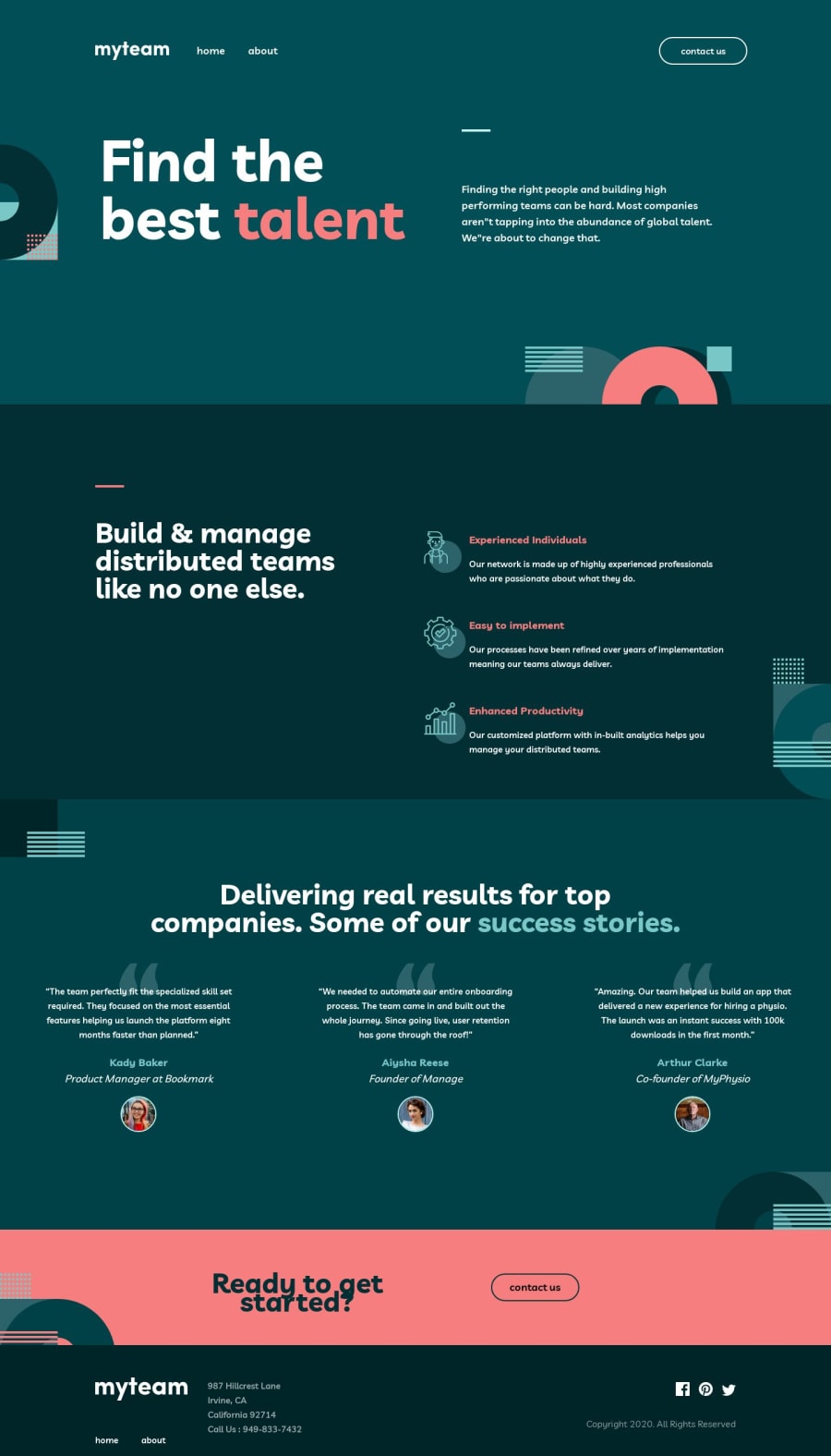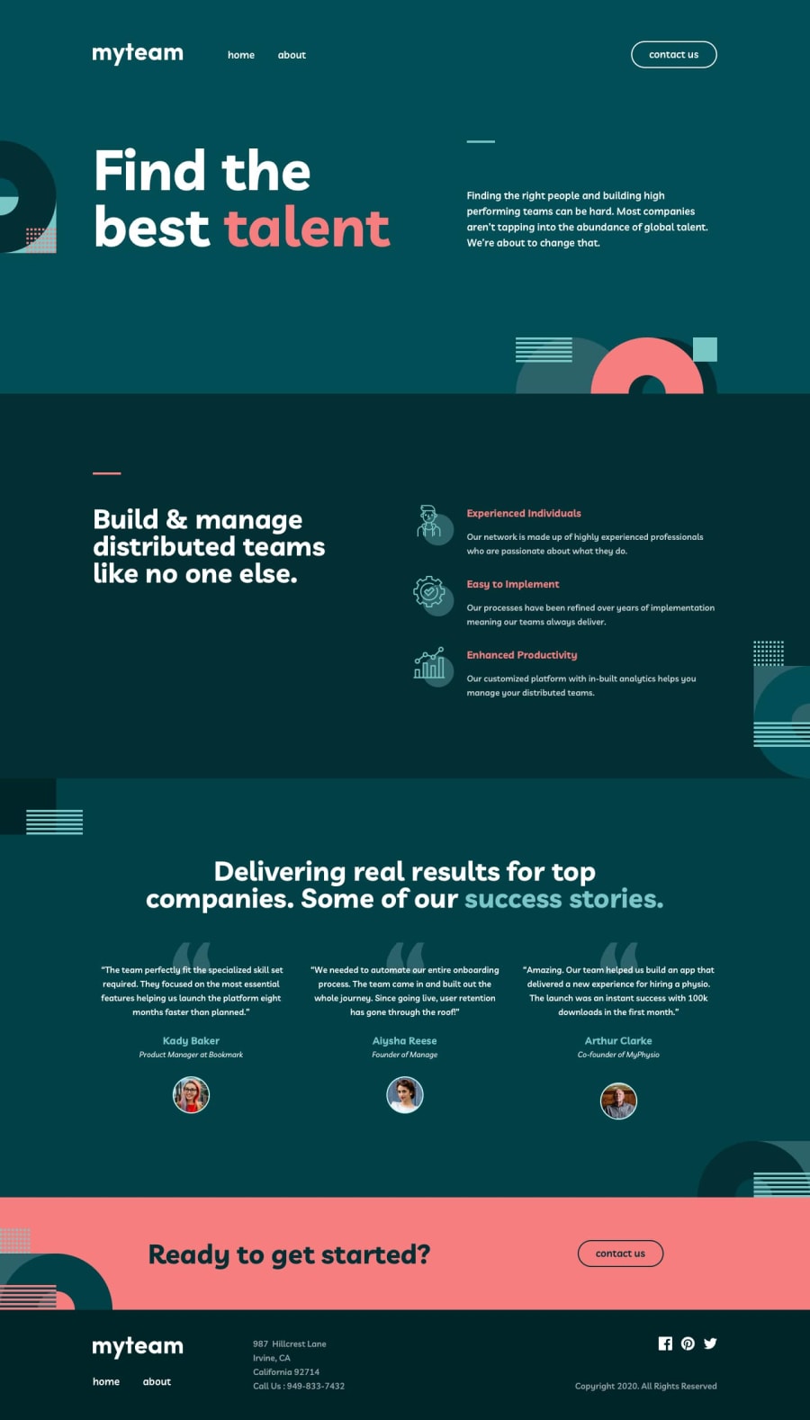
Design comparison
SolutionDesign
Solution retrospective
Project went pretty smoothly.
Unsure about some of the styles since it's my first time using Figma. I know the contact page on desktop might break in some cases.
Is using position relative to place the images the right thing to do or is there a better/most efficient way of doing it?
Thanks for your help :)
Community feedback
Please log in to post a comment
Log in with GitHubJoin our Discord community
Join thousands of Frontend Mentor community members taking the challenges, sharing resources, helping each other, and chatting about all things front-end!
Join our Discord
