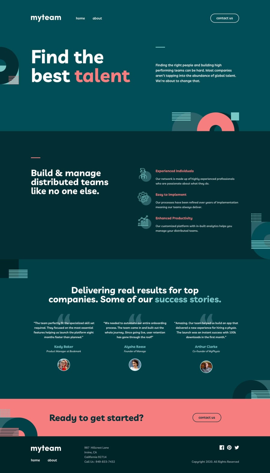
Design comparison
Community feedback
- @grace-snowPosted about 4 years ago
This looks nice
I think your folder names could cause problems. You want to avoid paths with spaces and these are usually all kept lowercase.
I'd make the logo a link back to home as that's an expected convention, and hive it the relevant alt text.
There's alt text missing on some other images too. You can add the attribute but leave it empty if it's not a meaningful image, but the attribute still needs to be there.
Hope that's helpful. We'll done on this, it's a lot of work!
Ps I love that menu animation, it really fits with the design
2@Baradel-ClementPosted about 4 years ago@grace-snow
Very helpful comments, I'll fix these little prob : )
Thanks a lot !
0
Please log in to post a comment
Log in with GitHubJoin our Discord community
Join thousands of Frontend Mentor community members taking the challenges, sharing resources, helping each other, and chatting about all things front-end!
Join our Discord
