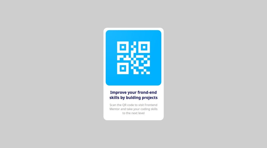
Design comparison
SolutionDesign
Please log in to post a comment
Log in with GitHubCommunity feedback
- @Behrouz-Babaki
- If we reduce the height of the browser window to less than the hight of the container, part of the page will have white background
- The font of the text (according to Figma design) is
Outfit - The QR code image is different from the asset provided in the challenge
- The background color is different from the target design
- The margin between the image and container seems to be slightly different from the design
Join our Discord community
Join thousands of Frontend Mentor community members taking the challenges, sharing resources, helping each other, and chatting about all things front-end!
Join our Discord
