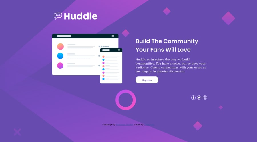
my-huddle-landing-page-with-single-introduction-challenge-solutio
Design comparison
Community feedback
- @k-stopczynskaPosted over 2 years ago
Hi,
I've reviewed your code. The site looks good, keep up the good work:)
Things that can be improved is semantics in HTML- <li> elements are children of <ul> element, not the other way. Also try to name classes and id's that the name would point what that element is about- it would be easier to read and understand (firstContainer is not self- explanatory, in this case imageContainer would be probably better). On accessibility point of view- alt attribute should be named in case of significant images (main image)- it's important for screen readers to know how to describe the content. Try next time mobile first approach- it's a lot easier to work with @media for bigger screens.
Good work on responsiveness and props for grid-attempt:)
Happy coding! szam
0
Please log in to post a comment
Log in with GitHubJoin our Discord community
Join thousands of Frontend Mentor community members taking the challenges, sharing resources, helping each other, and chatting about all things front-end!
Join our Discord
