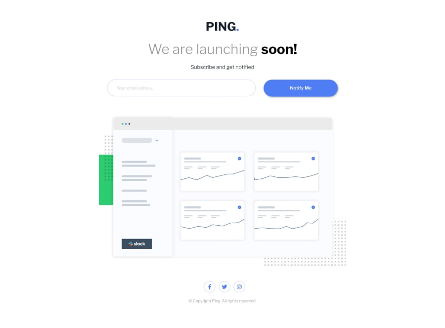
My take on this challenge
Design comparison
Solution retrospective
Fun little challenge, in regards to the error message when the wrong value is entered, i tried to dynamicallyinsert the error message from JS, it worked alright, but if you started spamming the submit button you would get like 10 error messages one after the other, which i could not figure to stop it from doing that, so i went the other way with a display block/none on a hard coded p element in the html file.
Community feedback
- @AdrianoEscarabotePosted about 2 years ago
Hi Alexandru Stefan Gherhes, how are you?
I really liked the result of your project, but I have some tips that I think you will enjoy:
- every Html document must contain the main tag, so we can identify the main content, to fix this, wrap all the content with the main tag. HTML5 landmark elements are used to improve navigation experience on your site for users of assistive technology.
- To improve the accessibility of the project you could have put an h1. Every page must contain a level 1 header, for people who use screen readers, identity what the main title is and follow the sequence h1-h5
- The links must have an aria-label or sr-only text that tells where the link navigates the user. For example: Visit our Facebook. For images, you should set aria-hidden=” true” to be ignored by screen readers and to avoid redundancy and repetition.
The rest is great!
I hope it helps... 👍
Marked as helpful0@AlexandruStefanGherhesPosted about 2 years ago@AdrianoEscarabote Thank you for the feedback, sometimes I forget to use semantic HTML notations, and just go with divs, but you are right about using it and considering accessibility as well.
1
Please log in to post a comment
Log in with GitHubJoin our Discord community
Join thousands of Frontend Mentor community members taking the challenges, sharing resources, helping each other, and chatting about all things front-end!
Join our Discord