Submitted 6 months ago
my take on the testimonials grid layout
#react#vite#sass/scss

P
@Fable54321

Design comparison
SolutionDesign

Please log in to post a comment
Log in with GitHubCommunity feedback
- P@Fable54321
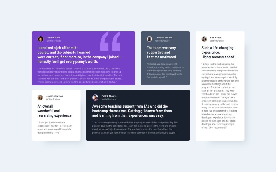
If you review this one **please open the live site ** front end mentor generates a screenshot way too fast. If you open the live site you won't even realize anything, but the text in the first card takes like half a second (if not less) to adjust on top of its background. I tried regenerating screenshots many times the screenshot still looks bad.
Now I know I could have used a different approach with absolute positionning but with the project done and fine in an actual real scenario, I'm not messing with it again ahah.
Join our Discord community
Join thousands of Frontend Mentor community members taking the challenges, sharing resources, helping each other, and chatting about all things front-end!
Join our Discord