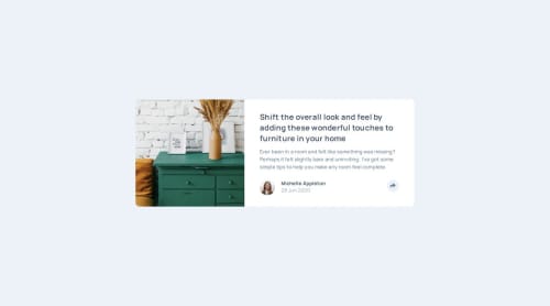
Design comparison
Solution retrospective
I woudl take a different approach for the share section on mobile.
Community feedback
- @herojk64Posted 17 days ago
Getting access to the Figma file you should get margin, padding, line height, etc. exactly matching. so that would be your improvement.
Marked as helpful1@Fable54321Posted 17 days ago@herojk64 Actually a lot of the figma files here don't have any spacings information. I guess it is to simulate real-life scenarios where you wouldn't have all the information.
For this one, all the spacings have been done only with my eye, but you are right it is important to take the time to make it right !
0@herojk64Posted 17 days ago@Fable54321 wrong it actually has it. how do I know? cause along with frontend designing I can use Figma and design few myself. you press alt see space between two elements and so on. for the line height, letter spacing you can adjust it properly. Front end mentor Figma file also gives them more decrepitly.
Marked as helpful1@Fable54321Posted 17 days ago@herojk64 Damn, I had no idea, I never used figma before starting here. The first few projects I could get the spacings just by clicking and for a few of them I couldn't anymore. Thanks for the information.
0
Please log in to post a comment
Log in with GitHubJoin our Discord community
Join thousands of Frontend Mentor community members taking the challenges, sharing resources, helping each other, and chatting about all things front-end!
Join our Discord