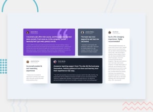
Design comparison
Community feedback
- @statanasovaPosted almost 4 years ago
Hey, cindoor :) Good job with the CSS grid.
Yes, I think you got the right idea for the opacity of the text colors - for the 'colored' cards you used white as a
globalcolor for all the texts and adjusted the opacity accordingly. And I believe you can do the same for the white cards - use the dark gray for all the texts in the card and change the opacity where needed. That will eliminate that slight difference between the black and the shades of gray that can be seen right now.Apart from that, I'd suggest making the website responsive by altering the grid for mobile screens. And what abdulrsf said above - limit the size of your
.gridcontainer and center it on the page so the cards won't become too wide on large desktops.Keep it up, I'd be glad to see more of your work :)
PS. Upvote if you found any of this helpful
2@codewithcindyPosted almost 4 years ago@statanasova thank you so much for the feedback! I figured out that setting
grid-template-columnshelped fill the spaces with the content.0 - @abdulrsfPosted almost 4 years ago
One way to fill the whole box is by making it smaller. Compare your box sizes to the given box sizes.
1 - @ApplePieGiraffePosted almost 4 years ago
Hello, cindoor! 👋
Well done on this challenge! 👍 Your solution looks quite good! 🙌
Like statanasova mentioned, centering the grid on larger desktop screens would be a good idea! Also, adding a tablet layout would be a nice touch so that the cards don't look too wide when the layout first changes from desktop to mobile. 😉
Keep coding (and happy coding, too)! 😁
0
Please log in to post a comment
Log in with GitHubJoin our Discord community
Join thousands of Frontend Mentor community members taking the challenges, sharing resources, helping each other, and chatting about all things front-end!
Join our Discord
