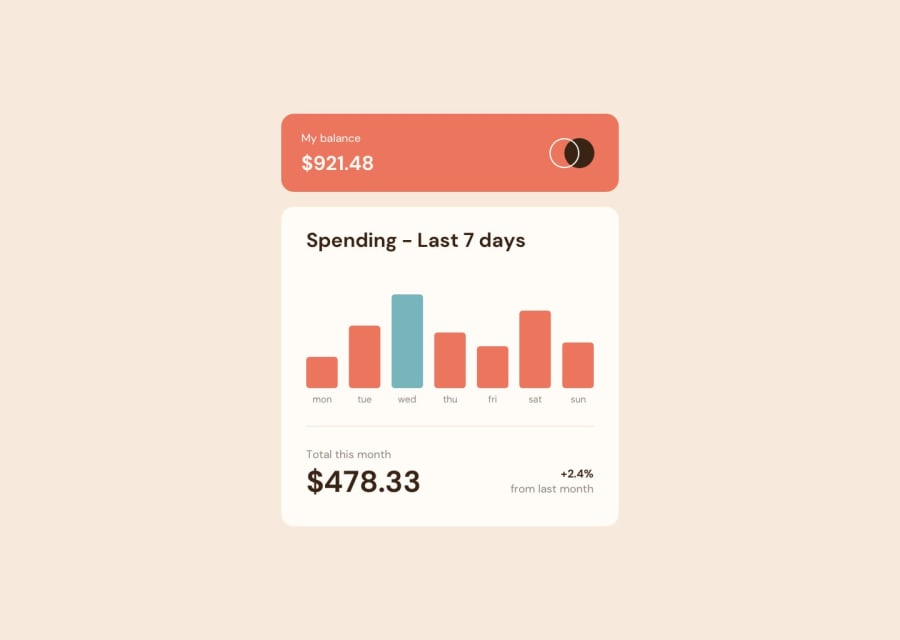
My solution to this challenge using react with css-modues & SASS
Design comparison
Solution retrospective
Let me know how I did on dis one and if there is anything that could be improved, thank u guys!!
Community feedback
- @elaineleungPosted over 2 years ago
Hey Julian, I think this was well done! It was easy to navigate through your App folders, and I'm also a fan of CSS modules, so anyway, the React looks good to me, as in no major issues I can really find. The only thing I'd do is just remove all the
console.loglines 🙂With the CSS, you can try making the component a bit bigger so that it can look closer to the original, and give things a bit more padding if possible. Other than that, everything looks good!
Marked as helpful0@juliflorezgPosted over 2 years ago@elaineleung Thank you so much Elaine, this really helps me. Hahah yeah so much
console.logfor debugging and testing, but I guess it helps for practicing version control with git 😅. I definitely will try to make it more like the original in terms of sizing and submit another try on this one.0
Please log in to post a comment
Log in with GitHubJoin our Discord community
Join thousands of Frontend Mentor community members taking the challenges, sharing resources, helping each other, and chatting about all things front-end!
Join our Discord
