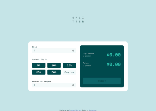
My solution to the Tip Calculator App

Solution retrospective
The HTML and CSS for this was done in two days, but the JS tied me down. Also, I was confused why there was no 'submit' button for this since this was a form. Anyway, calculator apps also behave like this, so...
Recognized a previous challenge can be included here and that was the Interactive Rating Component. It would be used where the user would select the tip in percent, but what about 'custom'? I thought about it and ended up using six radiobuttons with the last tied to an input field as 'custom'. I utilized event delegation to avoid assigning too many event listeners. A lot of tiny little things had to be tracked in order for keyboard navigation to behave in a standard manner.
Have a look see. If anyone can look at my JS and offer general tips for improvement I'd be grateful.
Please log in to post a comment
Log in with GitHubCommunity feedback
No feedback yet. Be the first to give feedback on wannacode's solution.
Join our Discord community
Join thousands of Frontend Mentor community members taking the challenges, sharing resources, helping each other, and chatting about all things front-end!
Join our Discord