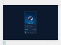
Design comparison
Solution retrospective
This code is not 1:1 ratio because i do not have pro so i only have images how project should look.
Community feedback
- @macdeeshPosted over 2 years ago
Hello Rado,
This is how you can improve your code :
1- What do you expect when you see a hover effect? You know something is clickable, right? That means it's an interactive element. Every place you see a hover style, you need to include an interactive element, like an anchor tag or button. That is essential to fix.
2- I would do the hover effect on this using pseudo-elements rather than adding extra in the HTML, but that's not essential. Also, for the other SVG icons you can use pseudo-elements like ::before or ::after, as the icons are all decorative.
3- You should have no text in spans alone. Always use meaningful elements, like paragraphs, headings, lists etc.
4- Font size should never be in px, always rem (or rarely em when you want it to inherit from a parent)
Marked as helpful0
Please log in to post a comment
Log in with GitHubJoin our Discord community
Join thousands of Frontend Mentor community members taking the challenges, sharing resources, helping each other, and chatting about all things front-end!
Join our Discord

