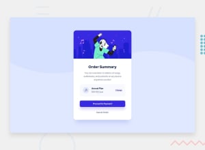
My solution for the order summary component challenge + dark mode
Design comparison
Solution retrospective
For this challenge, I tried to keep use of divs to a minimum, but still had to use them a fair bit, especially for the plan box. I didn't know how to separate and arrange the elements in the plan box without putting them in separate divs and classes. If there is a more elegant solution, please let me know, as I'm looking to develop good practices early on as a beginner. I also added a dark mode option to try to implement the javascript I'm still learning, and also make the solution a bit more unique. I was able to find a resource that helped me do it. I'm sure it maybe doesn't follow best UI design practices as I'm still learning that too. Also, this might be trivial, but if someone has tips on matching that overlay slider of our design to the original solution design, please let me know. I was wondering if it has to do with the way you take the screenshot. Thanks!
Community feedback
- @VCaramesPosted about 2 years ago
Hey, some suggestions to improve you code:
-
The “Illustration” and Music Icon serves no other purpose than to be decorative; It adds no value. The Alt Tag should left blank and have an aria-hidden=“true” to hides it from assistive technology.
-
There's only one heading this challenge and that's "Order Summary". So it should be wrapped in an <h1> Heading.
-
Your "button" was created with the incorrect element. When the user clicks on the button they should directed to a different part of you site. The Anchor Tag will achieve this.
Happy Coding! 👻🎃
Marked as helpful0 -
Please log in to post a comment
Log in with GitHubJoin our Discord community
Join thousands of Frontend Mentor community members taking the challenges, sharing resources, helping each other, and chatting about all things front-end!
Join our Discord
