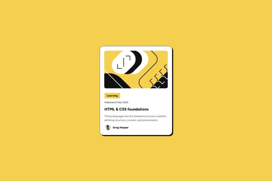
Design comparison
Solution retrospective
The Figma files wern't 100% accurate so I just fiddeled it out. I am also not sure if using all that flex boxes were really necessary or if there would have been an easier way to do it.
What challenges did you encounter, and how did you overcome them?Trying to get the figma desings to code.
What specific areas of your project would you like help with?I am not sure with the measurements using fixed width and height. Is this how it should be done? Also I am not sure about the use of all thoses flex boxes.
Please log in to post a comment
Log in with GitHubCommunity feedback
- @TedJenkler
Hi @Jan-Dev0,
Nice project! While it's possible to make this small project pixel-perfect and responsive, I would generally discourage aiming for pixel perfection. Instead, using rem and % units for a responsive and flexible layout tends to yield better results.
Your classes are well-made. However, consider adding aria-labels to help screen readers understand your content. Also, when possible, replace <div> elements with their semantic equivalents to enhance both accessibility and search engine optimization.
Keep up the great work!
Best, Teodor
Marked as helpful - P@MikDra1
If you want your solution to be just like the design shows I encourage you to use Pixal Perfect extension
Hope you found this comment helpful 💗💗💗
Good job and keep going 😁😊😉
Marked as helpful - @AgilePanda482
Yep, that's the correct way to use “flexbox”. So, don't worry about it, just a recommendation:
Don't write all the code in the “body” tag, it's better to use a div with “container” class or also the “main” tag.
Congratulations!
Marked as helpful
Join our Discord community
Join thousands of Frontend Mentor community members taking the challenges, sharing resources, helping each other, and chatting about all things front-end!
Join our Discord
