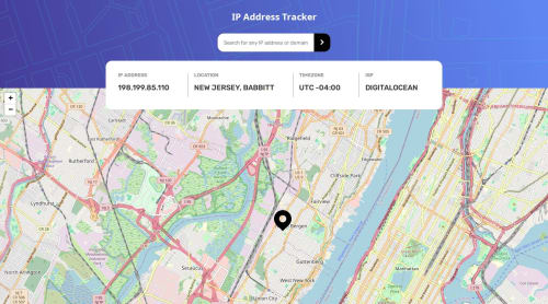
Submitted about 1 year agoA solution to the IP Address Tracker challenge
My solution for Ip Address Tracker
@MDEGORRE

Solution retrospective
What are you most proud of, and what would you do differently next time?
This is my first Frontend Mentor with API. I am happy that i could manage the errors if form is not properly filled.
What challenges did you encounter, and how did you overcome them?I was not used to work with leaflet and i managed to get it right reading the documentation.
What specific areas of your project would you like help with?- I am not really satisfied with the width of the form. On the mobile design, it is the same width as the result content but desktop seems like half of it. I could not manage it. For the moment i use field-sizing but it works only for some browsers.
- When searching for IP if it is successfull, i am actually replacing the map with a new map which should not be good for performance. I tried looking on the leaflet doc but what i wanted was just moving the icon dynamically.
Code
Loading...
Please log in to post a comment
Log in with GitHubCommunity feedback
No feedback yet. Be the first to give feedback on Michael Degorre's solution.
Join our Discord community
Join thousands of Frontend Mentor community members taking the challenges, sharing resources, helping each other, and chatting about all things front-end!
Join our Discord