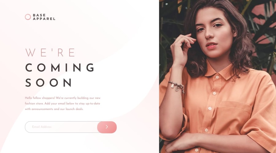
my solution for base-apparel-coming-soon-page .
Design comparison
Solution retrospective
welcome to all feedbacks
Please log in to post a comment
Log in with GitHubCommunity feedback
- @Jexinte
Hello @aymanelamin,
It's a good idea to do a left container for the text part and you should done the same for the banner on the right allowing you to use the display flex on the body and do crazy things : Flexbox
For the images as they are inline elements you should put them on a div apart the main one for the left container. For example you have an <img> tag with the id"logo" put it in a div. Or you have another the solution but I can't say if it's good to do it I hope someone that have more experienced will answer to it is to change the display from inline to block then you won't have to put it on a div.
The banner is not responsive from tablet size to desktop.
They're is some other things but I'm not well experienced to comment it.
Other than that it's a good job.
PS: I think that for the img tag you can even use the align-self property when flexbox is use to do good things with it.
Join our Discord community
Join thousands of Frontend Mentor community members taking the challenges, sharing resources, helping each other, and chatting about all things front-end!
Join our Discord
