Design comparison
SolutionDesign
Community feedback
- P@Smailen5Posted about 1 year ago
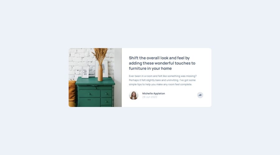
Great, the solution is similar to the request. You might have forgotten
background-size: cover;for the image, so you should center the image better as in the requested layout.0
Please log in to post a comment
Log in with GitHubJoin our Discord community
Join thousands of Frontend Mentor community members taking the challenges, sharing resources, helping each other, and chatting about all things front-end!
Join our Discord
