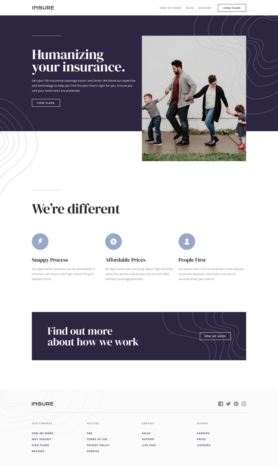
Design comparison
Solution retrospective
Hi everyone,
Happy to share with you one of my first project as a beginner. I begun this challenge a long time ago - almost one year now - and pause it.
When I rediscover it recently I try to fix some issues but I want to publish it as it was : a first challenge. I will improve it from now reading your comments.
I know how to improve a lot of things as I improve my coding skills since I opened this challenge. I know I didn't commented the code well, I didn't pay enough attention to maintainability, BEM, accessibility etc... all these things I have learn few month ago but I wasn't conscious of it when I begun this challenge. I prefer to enrich myself with your advices and fix it together rather than only doing this alone so feel free to say everything you want. Have a good moment discovering it, I hope it'll not be to difficult to understand as it is not a clean code example, sorry.
Community feedback
- @elaineleungPosted over 2 years ago
Hi Amaury, excellent work here, and I think you should be proud of yourself for all the learning you've done that allowed you to finally complete this project. I'm glad you picked things up from where you left off instead of getting discouraged and not finishing it; I also have the tendency to put things down for awhile and then revisit them later once I gain more skills.
One suggestion I have about your code is to refrain from mixing id selectors with class selectors in your CSS, especially since the names you've used are so similar to one another. You never know if you might run into specificity issues somewhere down the road where you have no idea why a certain style is applied or why you aren't able to change a style. Anyway, since you know BEM, you might want to consider learning Sass to write your CSS; you may find that it will greatly enhance your CSS writing experience.
Some quick feedback on your work: Some parts aren't displaying the font face in the design, like the paragraph text in section one. Also, about the note on the
nav
in the accessibility issues, since you have more than onenav
, you might need an aria label in the nav to indicate which nav it is (something like<nav class="nav-header" aria-label="navigation-header">
).Once again, congrats on the work you put in here, and keep going!
Marked as helpful1
Please log in to post a comment
Log in with GitHubJoin our Discord community
Join thousands of Frontend Mentor community members taking the challenges, sharing resources, helping each other, and chatting about all things front-end!
Join our Discord