Not Found
Not Found
Not Found
Not Found
Not Found
Not Found
Not Found
Not Found
Not Found
Not Found
Not Found
Not Found
Not Found
Not Found
Not Found
Not Found
Not Found
Not Found
Not Found
Not Found

Submitted

My solution (Blog card)

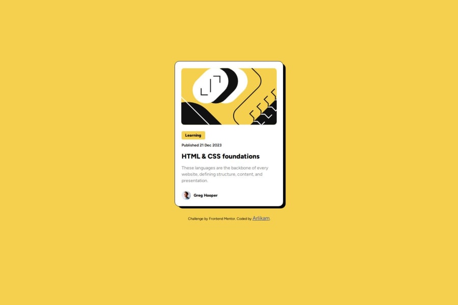
Desktop design screenshot for the Blog preview card coding challenge

This is a solution for...

  • HTML
  • CSS
1newbie
View challenge

Design comparison


SolutionDesign

Solution retrospective


What are you most proud of, and what would you do differently next time?

I am very happy with the help that doing these projects provides, I feel that I improved a lot in covering details. If there is something I would improve it would be the way I apply sizes and measurements. Regarding the rest I am very happy. ❀

What challenges did you encounter, and how did you overcome them?

I had a little difficulty making the size of the card and the other elements as close to the project example without using pixels, so instead I used em and rem. In the end I was able to apply them after several tests with measures that I think could be improved for next time.

What specific areas of your project would you like help with?

I would like help with the measures I applied, I'm not entirely sure if they are correct or if there are better ways to apply them.

Community feedback

Dylan de Bruijnβ€’ 3,190

@DylandeBruijn

Posted

@RomPirsZ

Hiya! πŸ‘‹

Congratulations on your solution, it looks very close to the design! I can tell you put a lot of effort into it.

Things you could improve ✍️

  • I suggest adding a bit of padding to your body element so the card has some space around it on smaller viewports.

  • You could add a min-height: 100vh to your body element so it takes up the full height of the viewport while still being able to grow when the content inside it grows.

  • Try experimenting with CSS variables, they help you make your CSS values more reusable across your code.

  • I suggest using clear descriptive CSS classes like .card, .card-title and .card-description.

  • Try using semantic HTML elements like main, section and article.

  • Try using using relative CSS units like rem and em they make your layout more adaptable.

  • Be careful with setting a fixed width and height on your elements. If the content in these elements grows beyond these restrictions you’ll run into overflow issues. Keeping the height at auto - which block elements are by default - will be fine in most cases.

  • You don’t have to wrap your image in a separate div, it’s possible to style it directly to achieve the same result.

  • Try centering your card using Flexbox instead of padding and margin.

I hope you find my feedback helpful! 🌟

Let me know if you have more questions and I'll do my best to answer them. πŸ™‹β€β™‚οΈ

Happy coding! 😎

Marked as helpful

1

Please log in to post a comment

Log in with GitHub
Discord logo

Join our Discord community

Join thousands of Frontend Mentor community members taking the challenges, sharing resources, helping each other, and chatting about all things front-end!

Join our Discord